About the project
Law firm website design for FBFK Law, a people-first, entrepreneurial firm with seven offices across Texas and California. Deep navy, quiet gold and an elegant serif voice present ten practice areas, a strong culture and a growing team with the clarity business leaders expect, together with the firm's print, stationery and imagery.
Law firm website design has one job before any other: to earn trust in a few seconds. A business owner looking for counsel judges a firm by its website long before the first call. For FBFK Law, a people-first, entrepreneurial firm with offices across Texas and California, we designed a website that feels as clear, confident and human as the firm itself.
Designed for business, centered on people
FBFK describes itself in six words: designed for business, centered on people. The firm sees itself as a team of builders, creators and collaborators, and believes law works best when it is practised with clarity, integrity and genuine human connection. Our law firm website design had to say all of that without a single legal cliché.
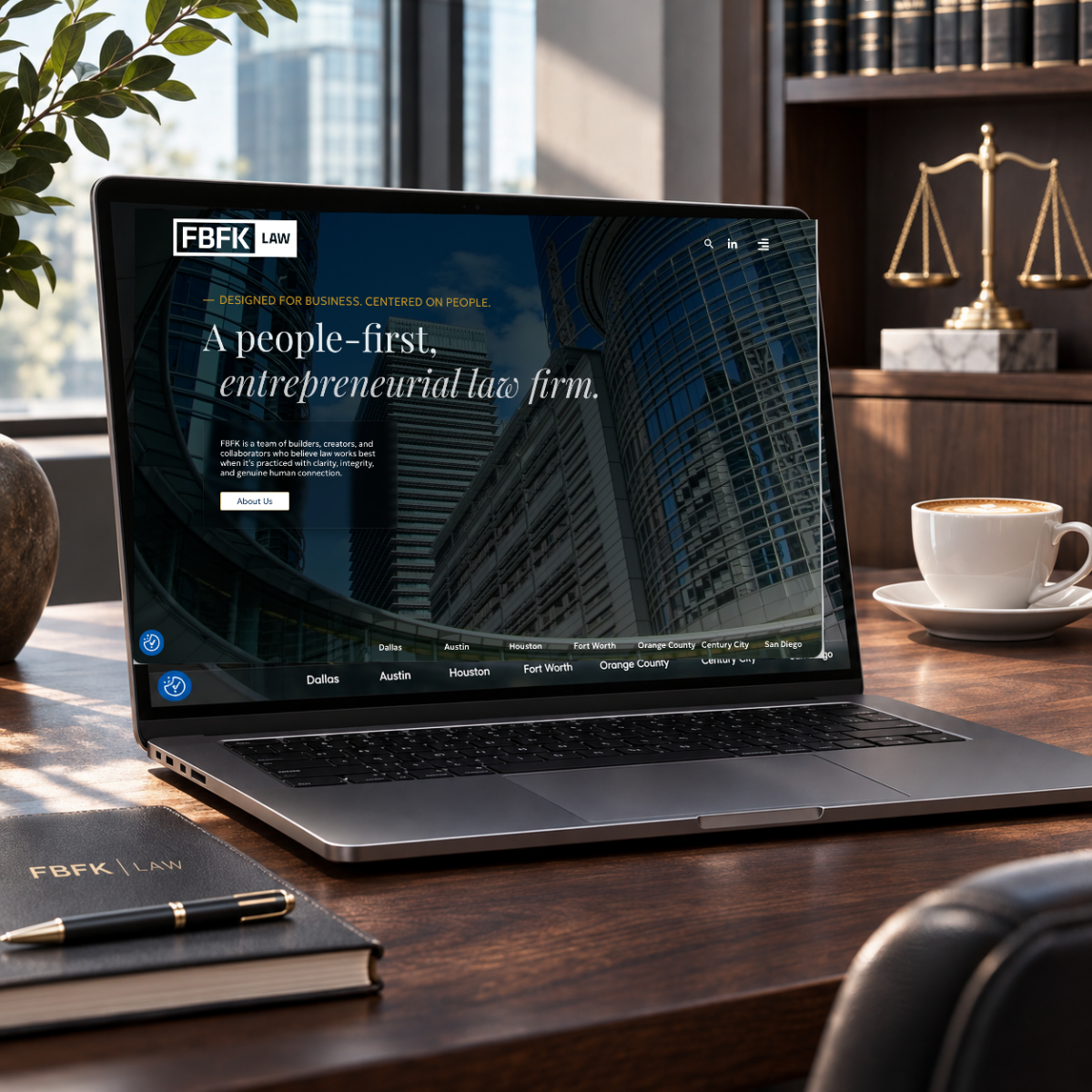
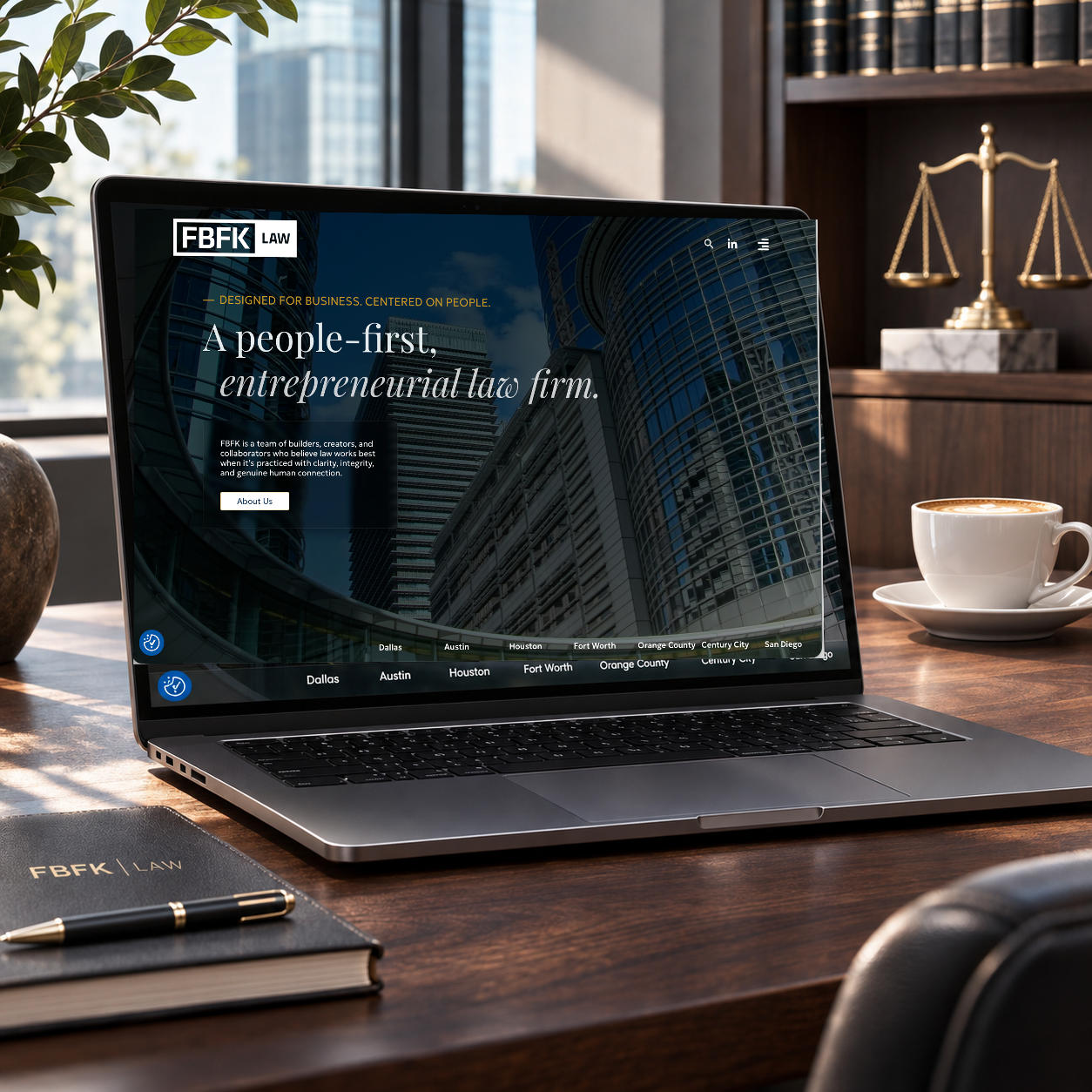
So the line leads the home page. A small gold tagline sits above a large serif headline, A people-first, entrepreneurial law firm, with the second half set in italics for a personal, almost handwritten touch. Below it, two short sentences and one button invite the visitor to learn more. Nothing more is needed.
Law firm website design that feels human
Many legal websites look cold: grey stock photos, dense text and endless lists. For this law firm website design we chose a different tone. Deep navy gives the firm the weight and seriousness clients expect from counsel, while touches of gold add warmth and a sense of quality. Architectural photography of modern glass towers speaks of ambition and the business world FBFK serves.
The typography carries the personality of this law firm website design. An elegant serif for headlines brings tradition and authority; a clean sans-serif keeps body text easy to read on every screen. Generous spacing lets each message breathe, so the site feels calm rather than crowded.
Seven offices, one firm
FBFK practises from seven offices: Dallas, Austin, Houston and Fort Worth in Texas, and Orange County, Century City and San Diego in California. A simple bar along the bottom of the home page lists them all, so visitors immediately see a national firm with local presence. Each location leads to its address and phone number, one tap away on a phone.
Ten practice areas, easy to find
In law firm website design, structure matters: business clients arrive with a specific need. The website organises the firm’s ten practice areas, from Corporate, Securities and M&A and Litigation and Trial to Intellectual Property and Technology, Real Estate, Tax, Labor and Employment, Bankruptcy and Restructuring, Estate Planning, International Transactions and Healthcare, into a clear Capabilities menu. Every area has its own page, written for business leaders rather than for other lawyers.
Culture on the page
What makes FBFK different is its culture, and the website gives it room. The FBFK Way sets out the values the firm lives by, from honouring commitments to listening generously and speaking straight. FBFK Vision 2.0 describes a platform built for exceptional attorneys who serve exceptional clients. For a firm that competes for talent as much as for clients, this matters: careers pages, open positions and a Summer Associate Program sit close at hand.
Content that keeps the firm current
A good law firm website design keeps growing after launch. Blogs, press coverage, media appearances and success stories give FBFK a steady stream of fresh content, each type with its own clear layout so the firm’s team can publish quickly and consistently.
Print, stationery and art direction
The same identity carries beyond the screen. We worked on FBFK’s printed material and stationery and directed imagery that matches the website: navy, gold and a calm, premium tone, from a leather-bound notebook on a desk to presentations in the boardroom. Online and offline, clients meet one firm with one clear voice. Visit the firm at fbfk.law.
Why this law firm website design works
- It builds trust fast. Navy, gold and a confident serif say quality and seriousness in seconds.
- It feels human. Warm words and a personal headline reflect a people-first firm.
- It is easy to use. Offices, practice areas and people are always one or two clicks away.
The result is a law firm website design that works as hard for FBFK as its attorneys do for their clients.
Services in this project
Our work for FBFK Law combines web design, print and editorial, stationery and art direction. See more professional services projects.
Need a website for your firm? Tell us about it.