About the project
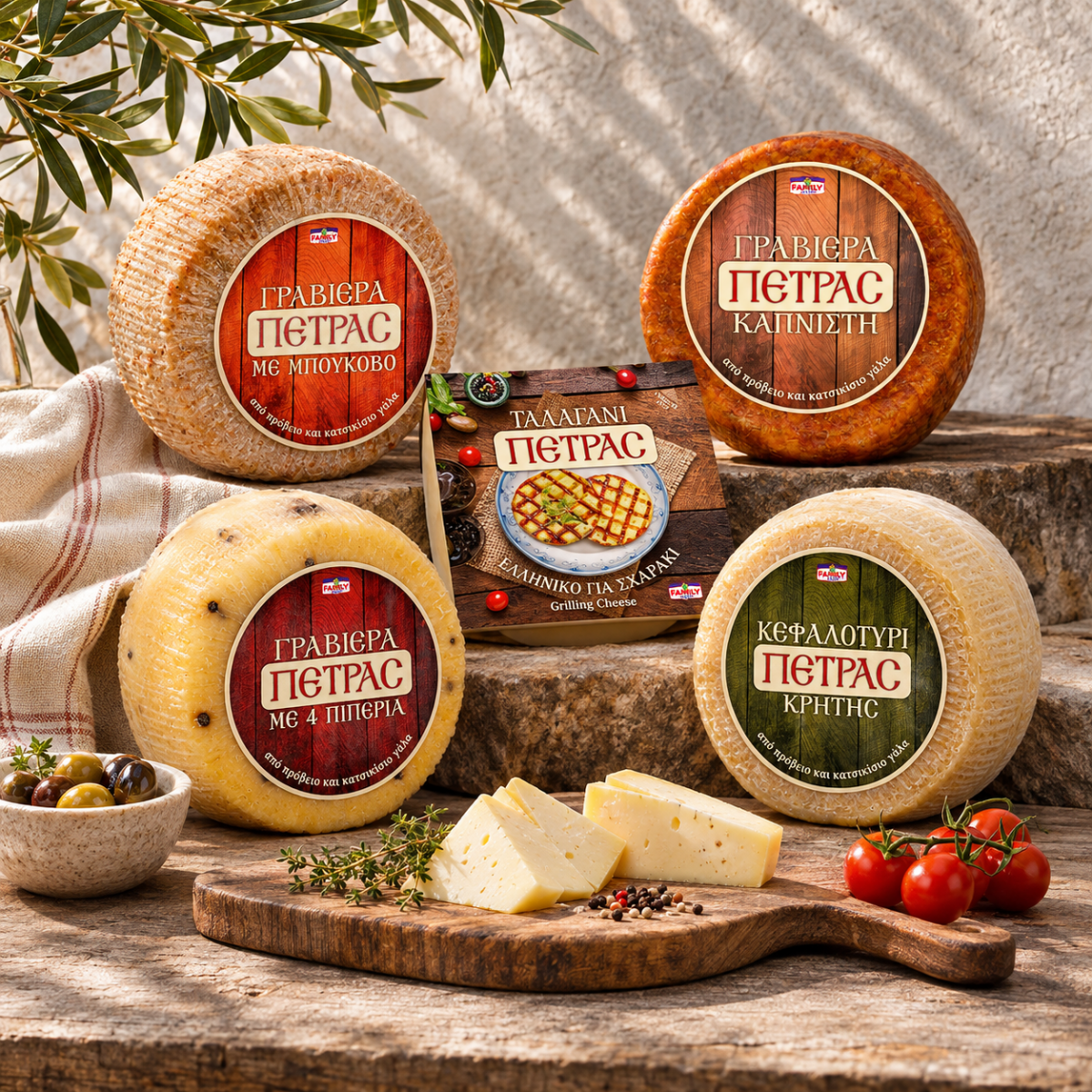
Cheese label design and packaging for Petras, a range of Greek cheeses by Family Food: three gravieras, a Cretan kefalotyri and a talagani for the grill. Coloured wood, a cream banner and traditional Greek lettering give every wheel the warmth of a village cheese shop and a clear place on the shelf.
Cheese label design for a traditional range has to feel honest. Shoppers want to see a cheese that comes from people who know their craft, not from a factory line. For Petras, the cheese range of Family Food, we designed labels and packaging that bring the feeling of a village cheese shop to the supermarket shelf.
Cheese label design with the warmth of a village shop
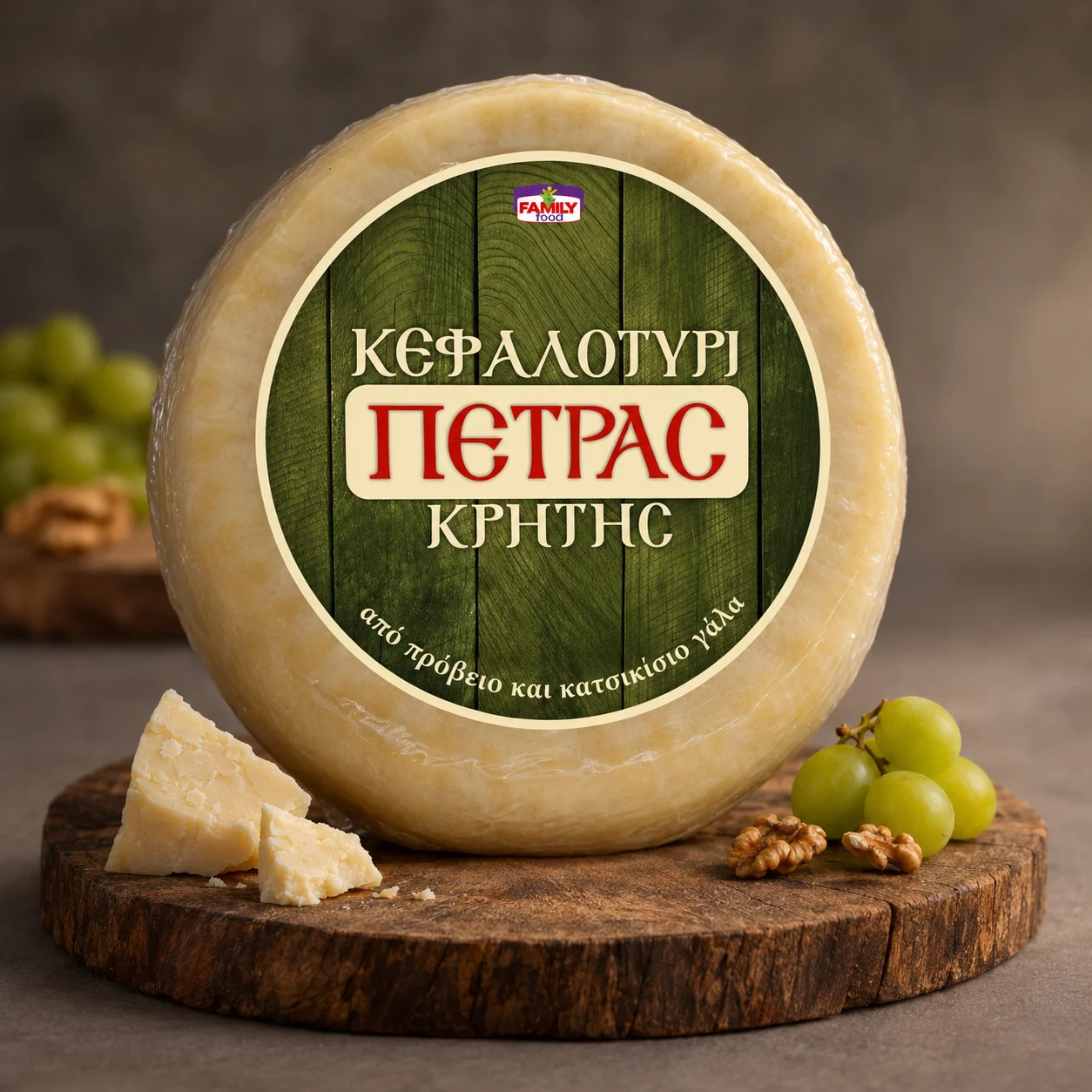
The idea started with the place where cheese is shared: the wooden board. Every Petras label is built on planks of wood, painted in a deep, natural colour, so each wheel looks as if it has just been set down on the table.
On top sits a cream banner with the name ΠΕΤΡΑΣ in red. Above and below it, the type of cheese and its flavour are written in Greek capitals, and a small line at the bottom says what matters most to buyers: από πρόβειο και κατσικίσιο γάλα, made from sheep’s and goat’s milk.
Lettering with Greek character
The lettering takes its shapes from old Greek shop signs and printed labels, with soft, rounded forms and a few traditional letters that give the range its character. It feels local and familiar without looking old-fashioned, and it stays easy to read on a round label from a distance, which matters in any cheese label design.
The Family Food logo appears small at the top of every label, a quiet maker’s mark that links Petras to the company behind it.
One colour for each flavour
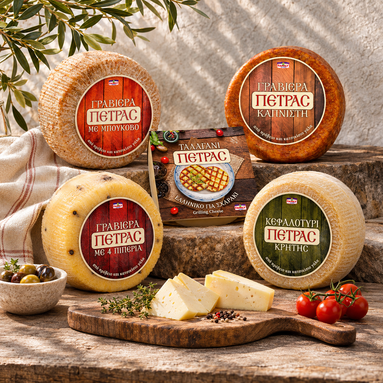
Colour tells the cheeses apart. The wood and the banner stay the same, while the colour of the planks changes with each product:
- Graviera with bukovo: warm red, for the gentle heat of chili flakes.
- Smoked graviera: smoky brown wood.
- Graviera with 4 peppers: a deep wine red.
- Kefalotyri Kritis: olive green, for the Cretan countryside.
Together the wheels look like one family on the counter, and each one can be found in a second. This is cheese label design that works as a system, ready for new flavours to join.
Talagani: a Greek cheese made for the grill
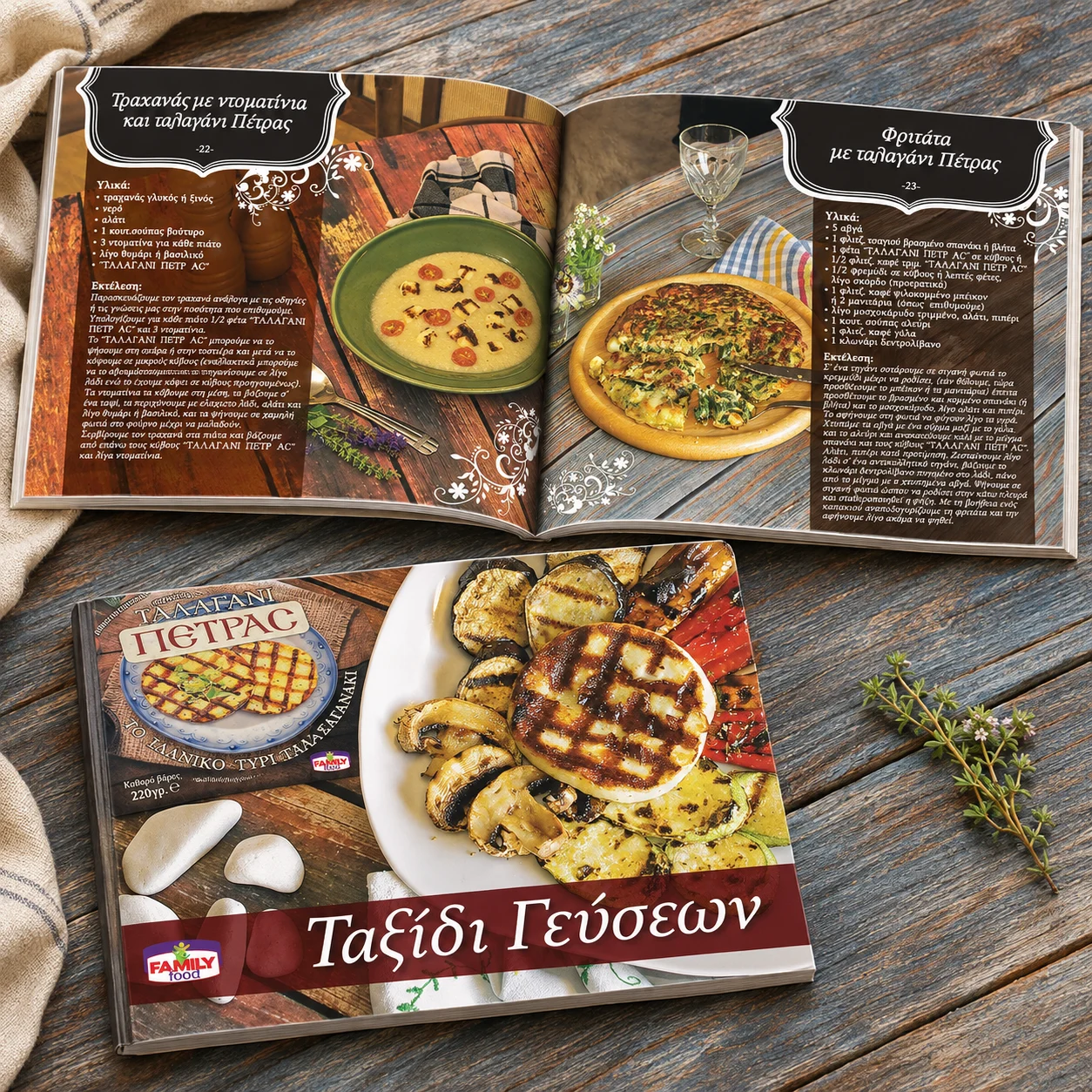
Talagani was first made in Messinia, in the Peloponnese, and takes its name from the local word for the shepherd’s heavy cloak. What makes it special is how it behaves with heat: it keeps its shape on the grill instead of melting, turning golden outside and staying soft inside, often with a light note of mint.
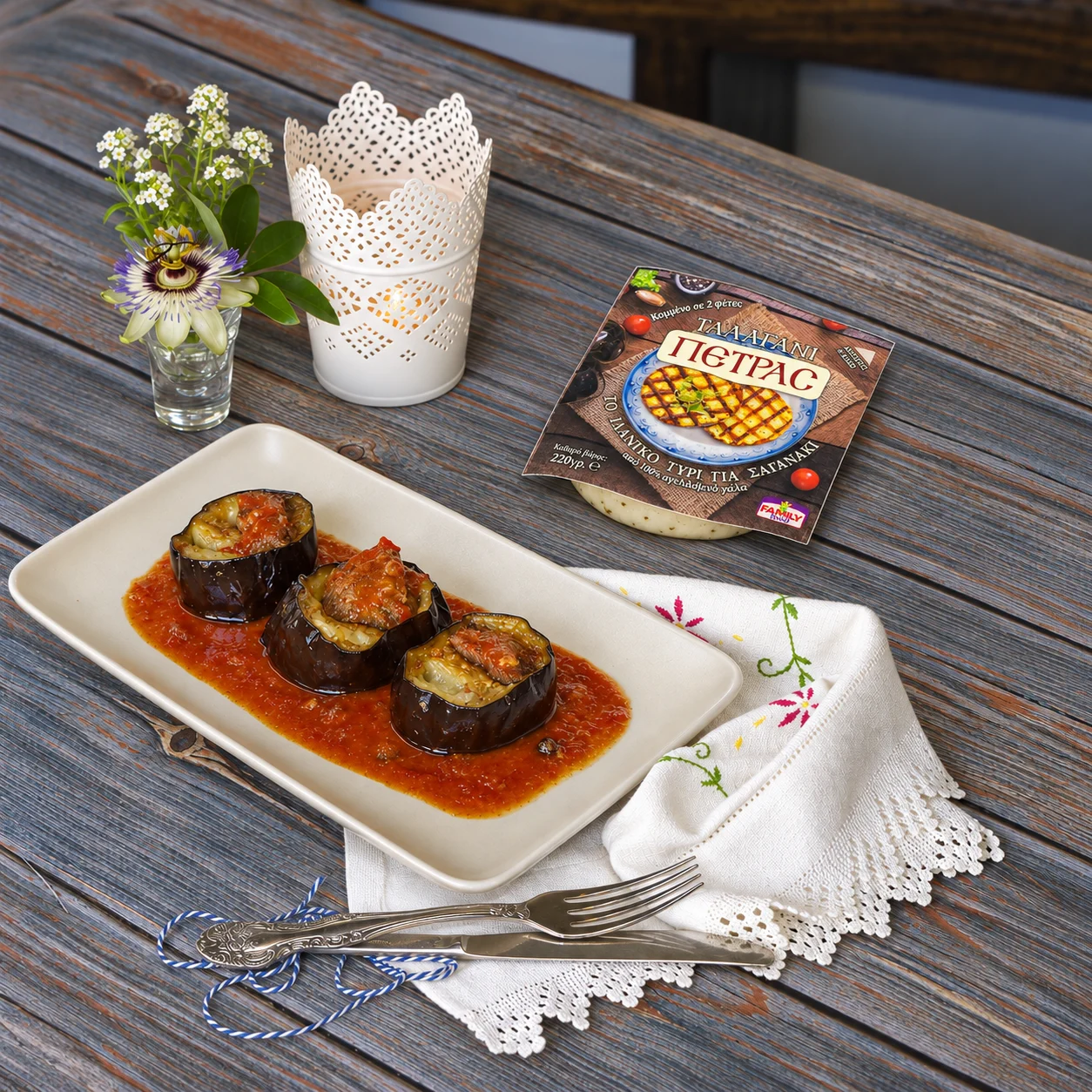
So the talagani pack shows exactly that. A square label on the same wood shows two grilled slices with dark grill marks on a blue-rimmed plate, surrounded by olives and tomatoes. The words Ελληνικό για σχαράκι and Grilling Cheese explain the use in Greek and English, so the cheese is understood by locals and visitors alike.
Round labels for whole wheels
Cheese label design for whole wheels has practical demands. The round labels fit wheels of different sizes, sit flat on a curved rind, and keep every piece of information in the same place from one product to the next. A printer can produce a new flavour by changing only the colour and the words.
Art direction for the product photography
We art-directed the photography to match the labels: rough stone and old wood, olive branches, cherry tomatoes, thyme and a linen cloth in soft afternoon light. The whole range was shot together, so the cheese label design and the photography tell one story and the brand looks the same in a catalogue, on social media or on a supermarket leaflet.
Why this cheese label design works
- It feels made by hand. Wood, cream and red give the range the warmth of a traditional cheese shop.
- It sorts by colour. One colour per flavour makes the right cheese easy to find.
- It explains the use. The talagani pack shows the grill, so nobody has to guess how to cook it.
The result is a cheese label design that sells the craft behind the cheese as much as the cheese itself.
Services in this project
This project combined our label design, packaging, brand identity and art direction work. See more food products projects.
Planning labels for your own cheeses or food range? Tell us about it.