About the project
Travel brand identity, logo and website for Open Ways Events & Travel in Thessaloniki, a company that designs events, seminars and journeys with culture at their heart. A gold half sun inside an open arc leads into a brand and a bilingual website for events, tours and slow tourism on Mount Olympus.
Travel brand identity is about a promise: that something good is about to begin. For Open Ways Events & Travel in Thessaloniki, a company that designs events, training seminars and travel experiences with culture at their heart, we created a logo, an identity and a website that capture that moment of setting out.
A logo that opens the way
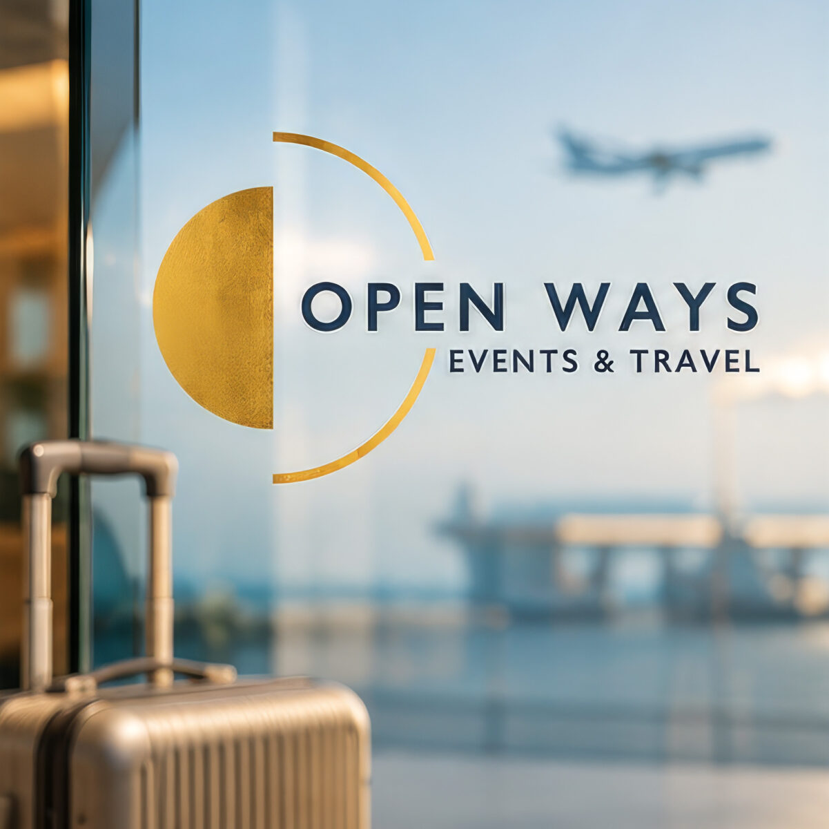
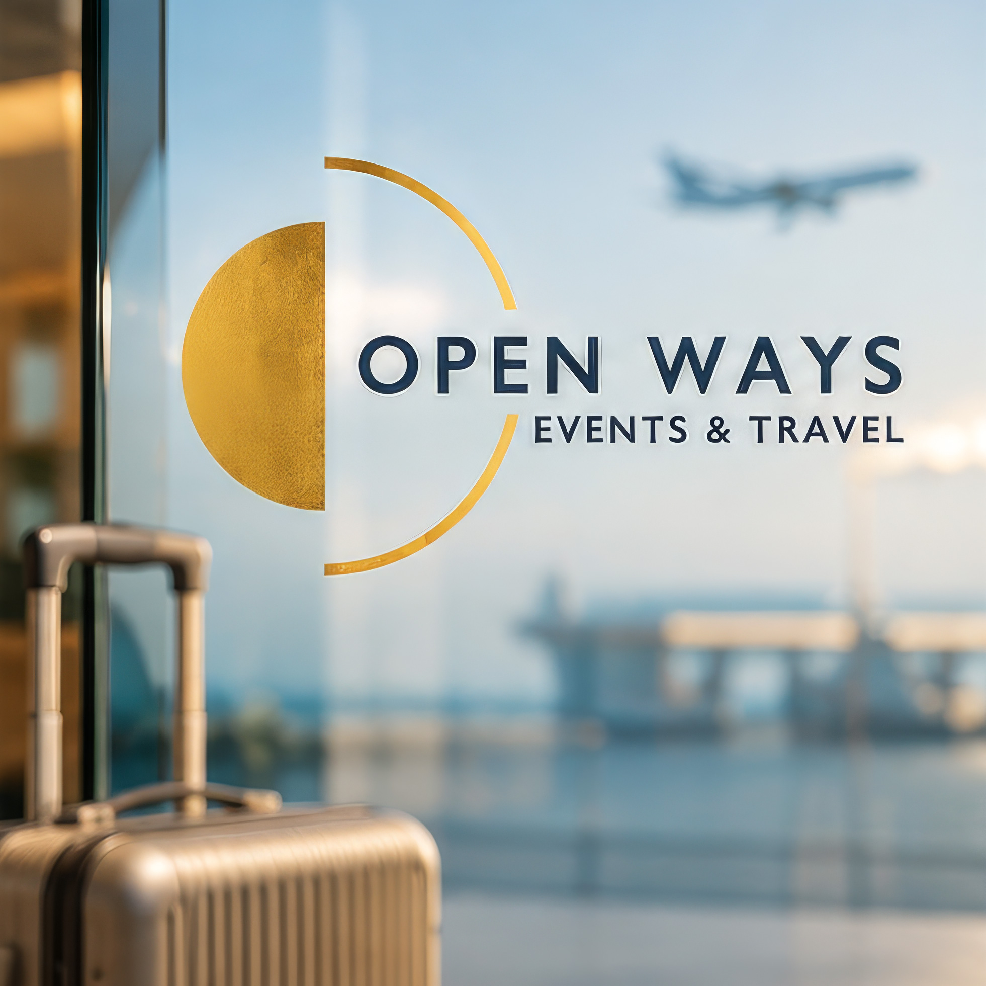
For this travel brand identity, the name gave us the idea. The Open Ways mark is a solid gold half-circle held inside a thin, open arc. It can be read as a sun rising over the horizon, as a door left ajar, or as the first half of a circle still waiting to be completed by the journey. Each reading says the same thing: the way is open.
Beside it, OPEN WAYS is set in clear navy capitals, with EVENTS & TRAVEL in smaller letters below. Gold brings warmth, light and the joy of travel; navy brings calm, reliability and the professionalism clients need when they hand over an event or a group trip. The travel brand identity works equally well on glass at the office, on a boarding pass sticker or on a conference badge.
Travel brand identity for events, travel and slow tourism
Open Ways does three things, and the identity had to hold them together. It organises events and seminars for institutions, associations and businesses. It designs travel packages and custom programmes for schools, clubs, companies, families and individuals. And it develops slow tourism, journeys that take time to understand a place.
One travel brand identity carries all three. The half sun, the colours and the typography stay the same, while photography and wording change with each audience, from a corporate seminar to a family trip or a hiking route on Olympus.
MYthic paTHS: slow tourism on Mount Olympus
One of Open Ways’ proudest projects is MYthic paTHS, a slow tourism proposal for Mount Olympus approved for funding under the European Medpearls project (ENI CBC Med Programme) and implemented in Greece by the Municipality of Thessaloniki. It invites travellers to explore the mythical paths of the mountain of the gods, respecting the ecosystem and discovering its nature, history and long tradition.
The website gives the programme its own section, with available packages such as Olympus Mythic Paths, so the project’s story and its tours are easy to find and easy to book.
A website that turns ideas into journeys
We designed and built openways.gr as a place where ideas become plans. Visitors can browse tours like Olympus Mythic Paths or In the footsteps of the Apostle Paul, check upcoming events in a monthly calendar, explore slow tourism and the Folkway Network, send a request for hotel booking or sign up for the newsletter. The site is available in English and Greek, ready for international groups as well as local clients.
Large images, short, inviting texts and clear buttons keep every page focused on one question: where would you like to go next? The travel brand identity runs through every page, from the gold accents to the navy headings.
Print, stationery and art direction
The identity extends to the company’s stationery and printed material, from business cards and letterheads to programmes, brochures and event materials. We also directed imagery that reflects the brand: bright skies, open landscapes and people enjoying the journey. Every piece looks and feels like Open Ways, the travel brand identity applied with care.
Rooted in Thessaloniki
Open Ways is a Thessaloniki company with an international outlook, and its brand reflects both. The warmth of the gold half sun recalls the light of northern Greece, while the clean typography and calm navy make the company feel at home with European partners, institutions and travellers from abroad.
Why this travel brand identity works
- It tells a story in one shape. A half sun in an open arc says beginning, horizon and opportunity.
- It unites different services. Events, travel and slow tourism share one confident look.
- It is ready to travel. Gold and navy work on glass, paper, screens and badges, in Greek and in English.
The result is a travel brand identity that opens the way for every journey Open Ways designs.
Services in this project
Our work for Open Ways combines brand identity, logo design, stationery, print and editorial, web design and art direction. See more hospitality and tourism projects.
Planning a new brand for your travel or events company? Tell us about it.