About the project
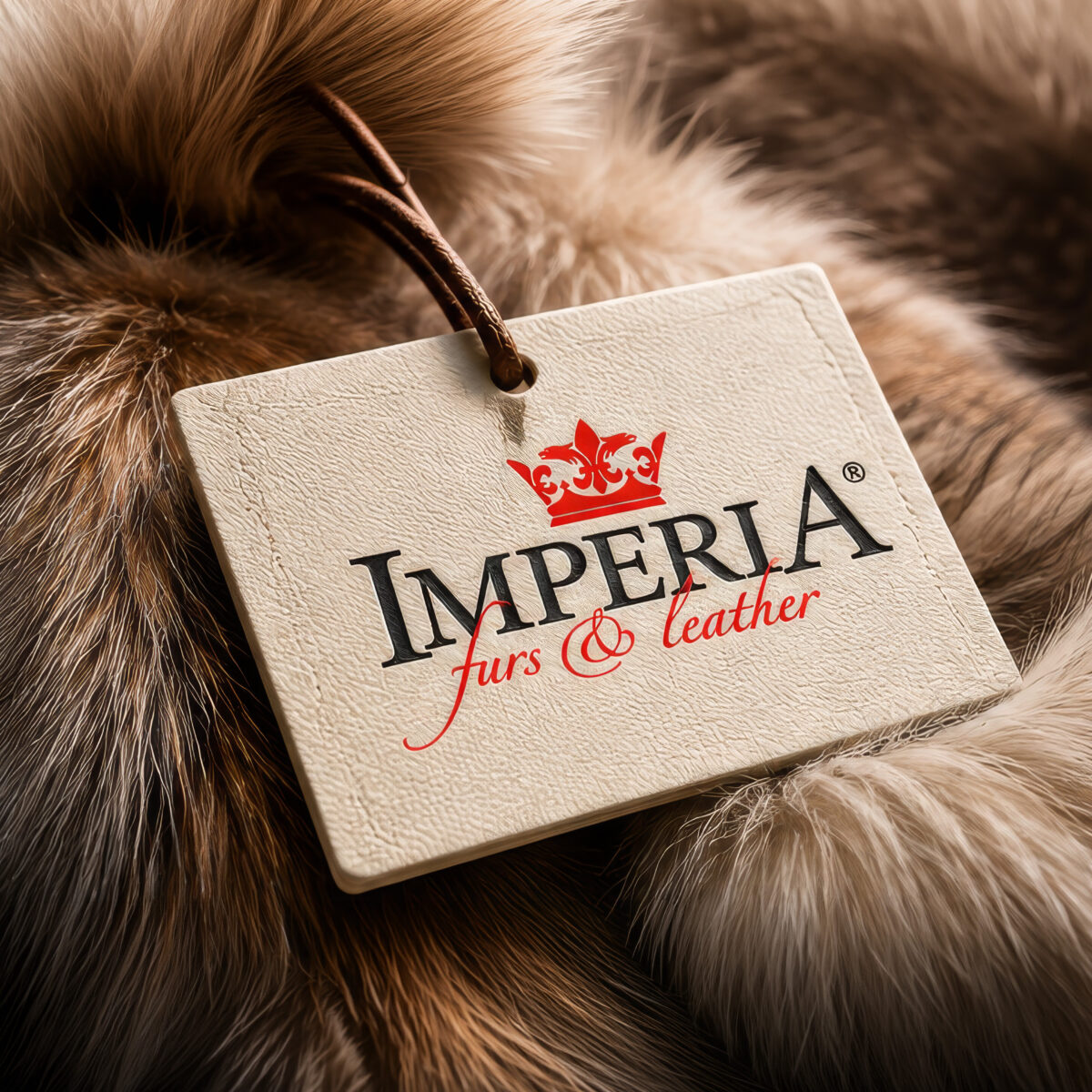
Fur brand identity for Imperia Furs & Leather in Pieria, Greece, a client of ours since 2005. Classical capitals, a red crown and a flowing script create a logo of quiet luxury, carried onto labels, hang tags, print and the store front, and kept consistent season after season.
A fur brand identity has to feel as lasting as the garments it stands for. Furs and leather are bought to be worn for years, so the name on the label must inspire the same confidence. Imperia Furs & Leather in Pieria, Greece has trusted us with that name since 2005.
A partnership since 2005
Working with a brand for more than twenty years is a rare privilege. Since 2005 we have designed the fur brand identity, its labels and its printed material, and looked after them season after season. Collections change, but the brand stays recognisable, because every new piece starts from the same rules.
Over the years we have refined details rather than reinventing the brand. That steady care is the reason a returning customer recognises Imperia at once, on a label, a bag or a sign.
A name that already means empire
Imperia comes from the Latin word for empire and power. The name asked for a symbol of quality and heritage, and the crown was the natural answer. Ours is drawn in red, with a fleur-de-lis at its centre and ornamental scrolls on each side, a classic emblem of craftsmanship and prestige.
The crown sits above the name, compact enough to work on its own as a stamp, an embossing or a button detail.
Classical capitals and a signature script
The name IMPERIA is set in classical black capitals with fine serifs, wide and steady like the lettering on old shop fronts. The first and last letters rise above the others, framing the word and giving it a crown-like outline of its own.
Beneath the capitals, furs & leather is written in a flowing red script with one long, elegant swash. It crosses the name the way a signature crosses a document, adding warmth and a personal, handmade touch to the formal capitals. Together they give the fur brand identity its balance: authority above, elegance below.
Black, red and natural tones
The palette is short and confident: deep black for the name, a rich red for the crown and the script. Both colours stay clear on the materials the brand lives on, from cream leather and paper to stone, dark fabric and natural fur.
Because the colours are so simple, the logo can also be embossed in leather, printed in one colour or engraved in metal without losing its character.
Labels and hang tags
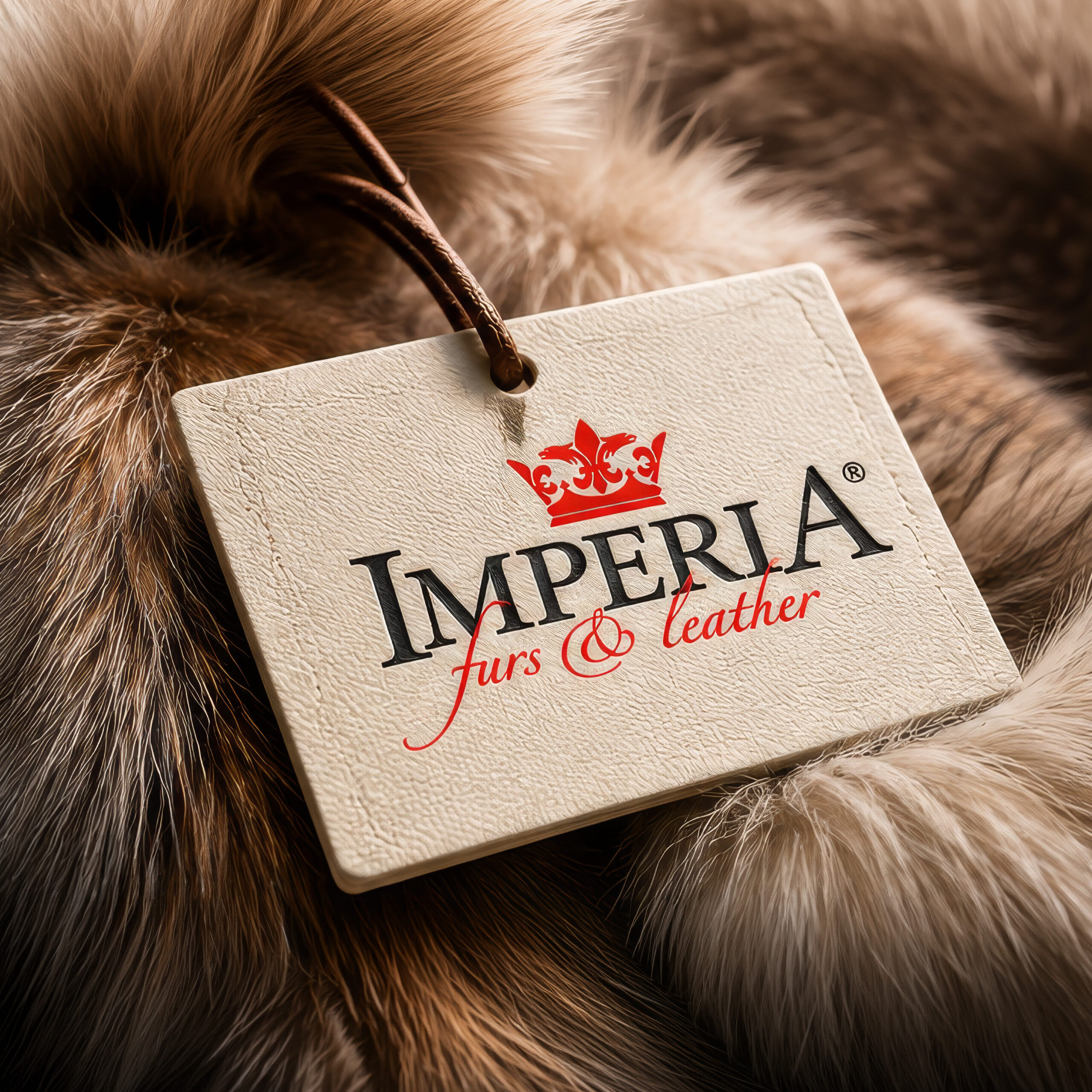
Labels and hang tags are where a fur brand identity meets the customer most closely. We designed them to feel like part of the garment: textured cream cards, leather cords and the logo printed or pressed into the surface, so the tag looks as considered as the coat it hangs from.
Every label follows the same fur brand identity rules, so the collection reads as one family on the rails of the store.
Print and art direction
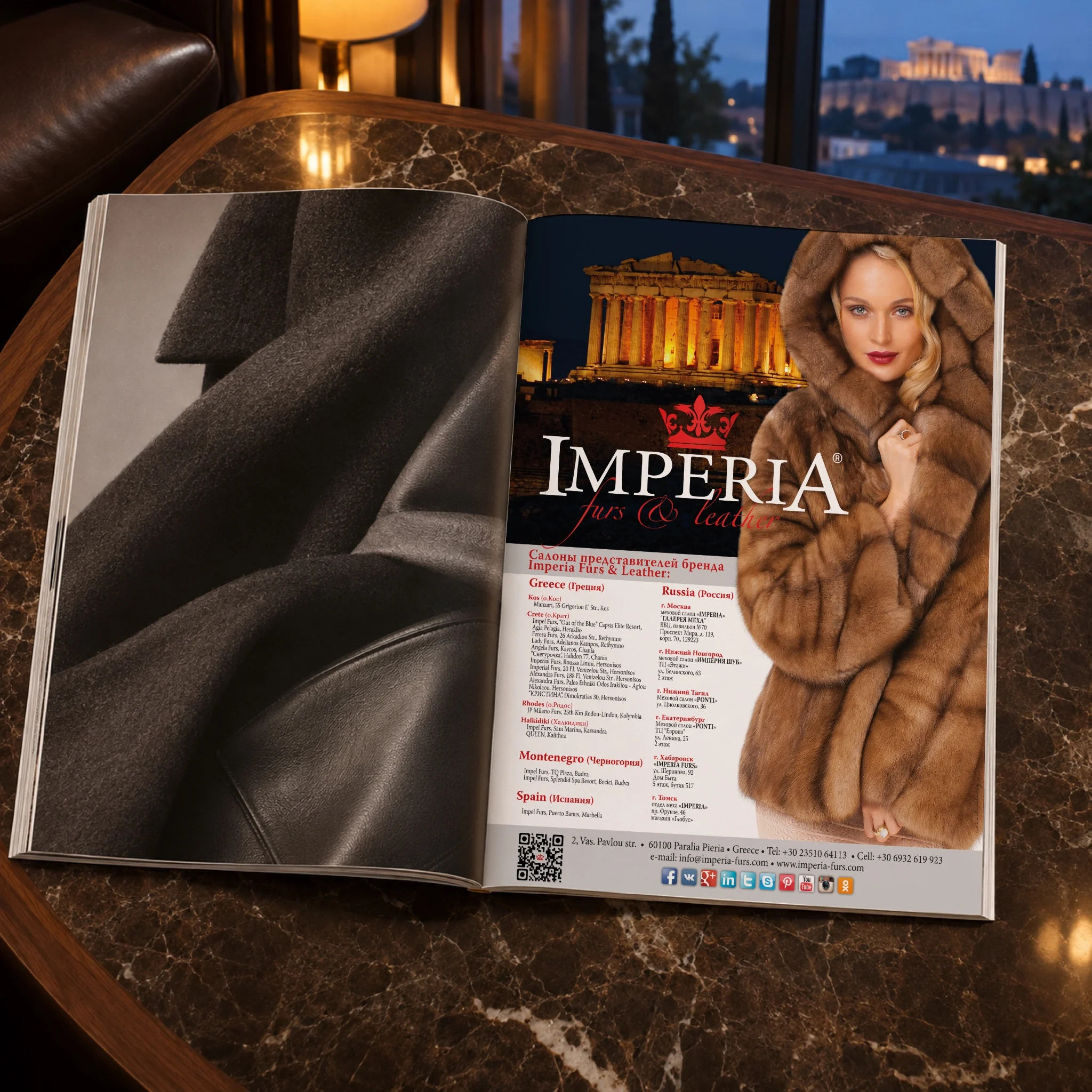
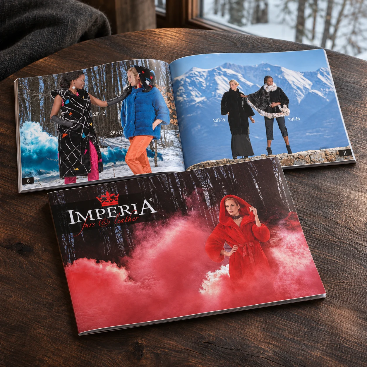
Season after season we have also designed Imperia’s printed material and directed its images, keeping a consistent look across catalogues, advertising and shop materials. Warm light, rich textures and calm compositions let the furs and leather speak for themselves.
From label to store front
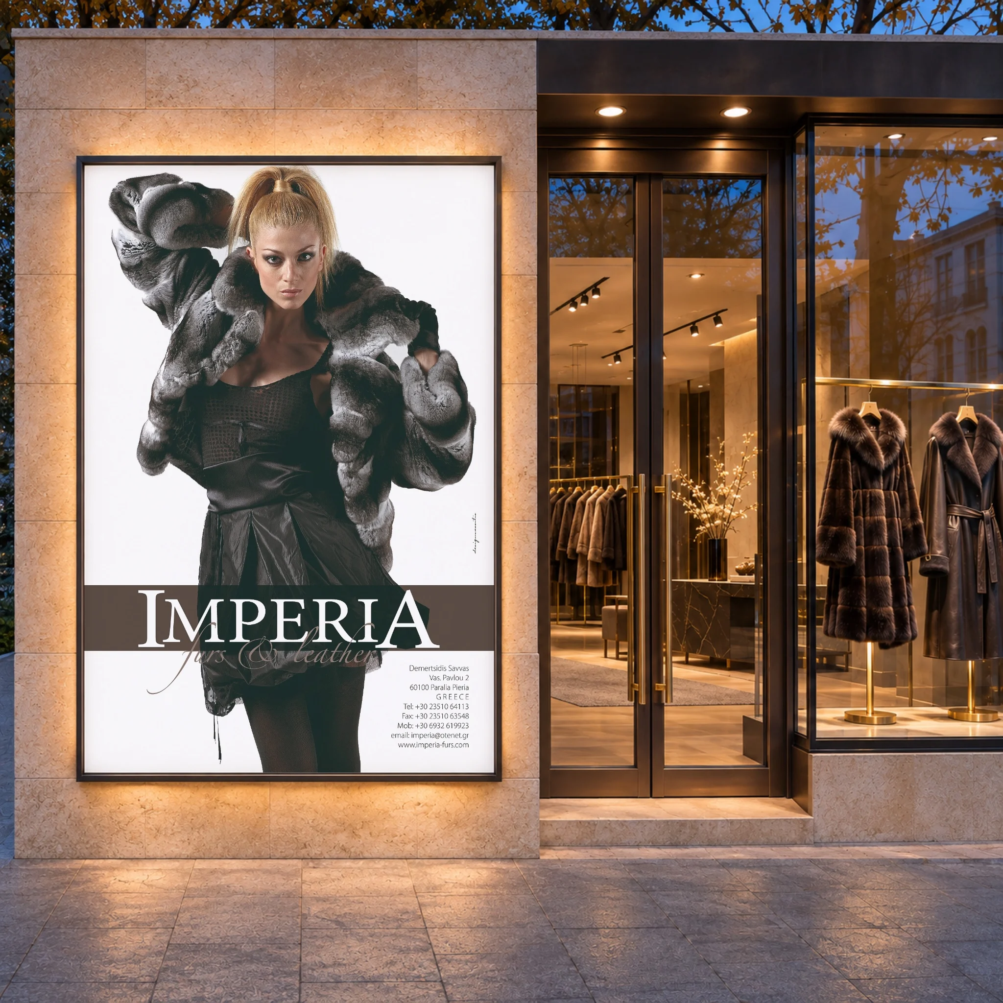
The identity scales from the smallest tag to the largest sign. On the store front the crown and the name stand out in raised letters on light stone, the red script catching the eye from the street. It is the same logo customers find on their label at home, which is exactly what a strong fur brand identity should achieve.
Why this fur brand identity works
- It is timeless. Classical capitals and a crown age well, which suits garments made to last.
- It is consistent. Since 2005 the same rules have guided every label, print and sign.
- It is flexible. Two colours and a compact crown work on leather, fur, paper, fabric and stone.
The result is a fur brand identity that has grown with its client for two decades and still looks as fresh as the first day.
Services in this project
Our work for Imperia combines brand identity, logo design, label design, print and editorial and art direction. See more culture and lifestyle projects.
Looking for a partner to build and care for your brand? Tell us about it.