About the project
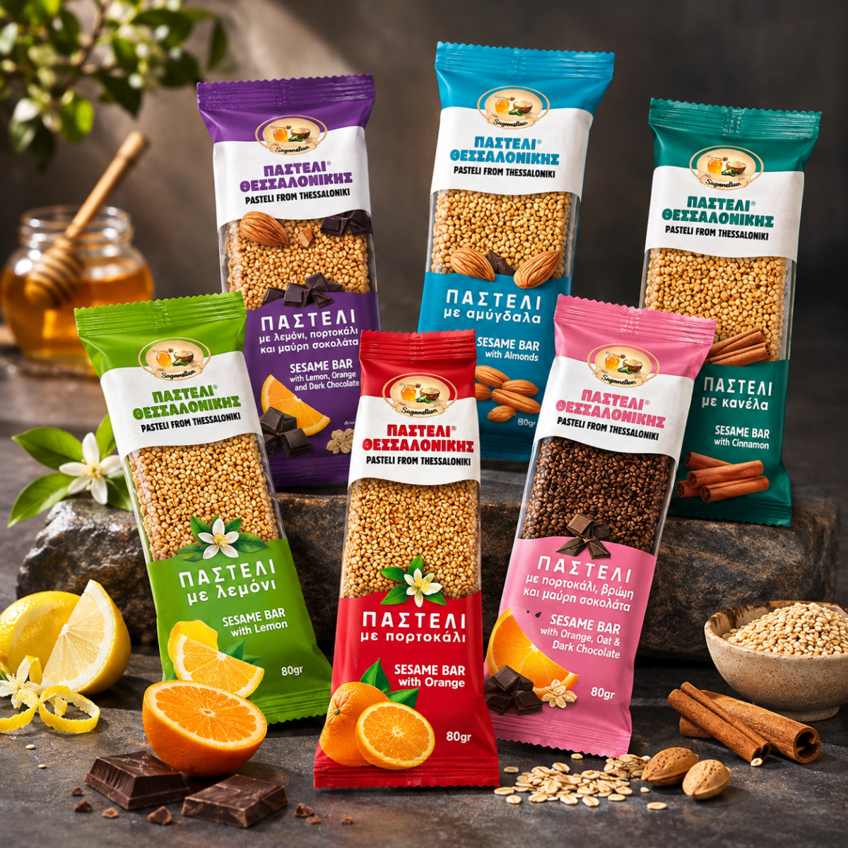
Pasteli packaging design for Pasteli from Thessaloniki, a 100% natural sesame bar in six flavours, from lemon and orange to almonds, cinnamon and dark chocolate. A classic layout with a light modern touch, a clear window on the bar and one colour per flavour make the range easy to choose and easy to trust.
Pasteli packaging design has an easy story to tell and a hard shelf to tell it on. Sesame and honey are among the oldest snacks in Greece, yet supermarket aisles are full of bars that look alike and many of them rely on glucose syrup and sugar. Pasteli from Thessaloniki is 100% natural, and the packaging we designed makes that visible at first glance.
Standing out on a crowded shelf
Before designing, we looked at how pasteli is sold today. Most packs use the same warm golden tones, small product windows and long lists of claims. Natural bars and sugary bars often look the same, so shoppers have little to go on except price.
For this pasteli packaging design we set three goals: show the real bar, keep the look classic so it feels trustworthy, and give every flavour its own clear colour. Everything on the pack serves those three ideas.
Pasteli packaging design that shows the real bar
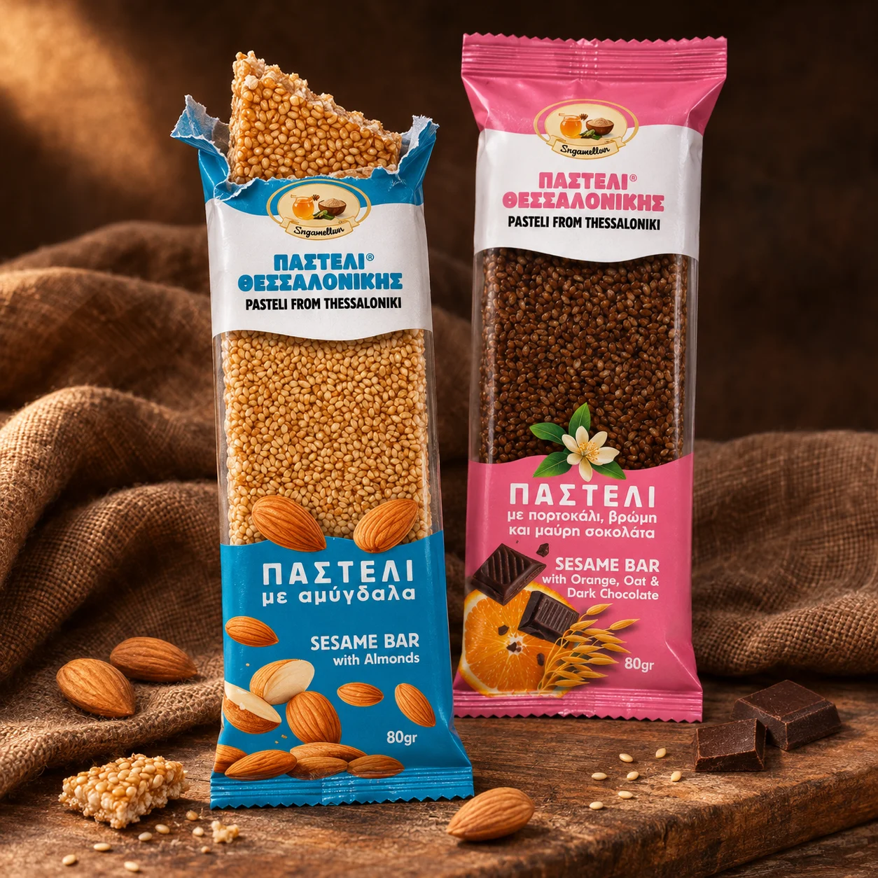
The heart of the design is a large clear window. Instead of a photo or an illustration of the product, buyers see the actual sesame bar, its seeds and its colour. For a natural product, honesty is the strongest message, and the window says it without a single word.
Above the window, a white band carries the name Παστέλι Θεσσαλονίκης and Pasteli from Thessaloniki, with a round badge showing a honey jar and a bowl of sesame. Below it, the colour panel names the flavour in Greek and English.
Classic, with a modern touch
We kept the overall look classic: centred layout, confident Greek capitals, a registered name and a calm white band that recalls traditional sweet shops. The modern touch is in the details: generous spacing, clean sans-serif type for the flavour names and fresh, saturated colours. The result feels familiar, but not old-fashioned.
One colour for each flavour
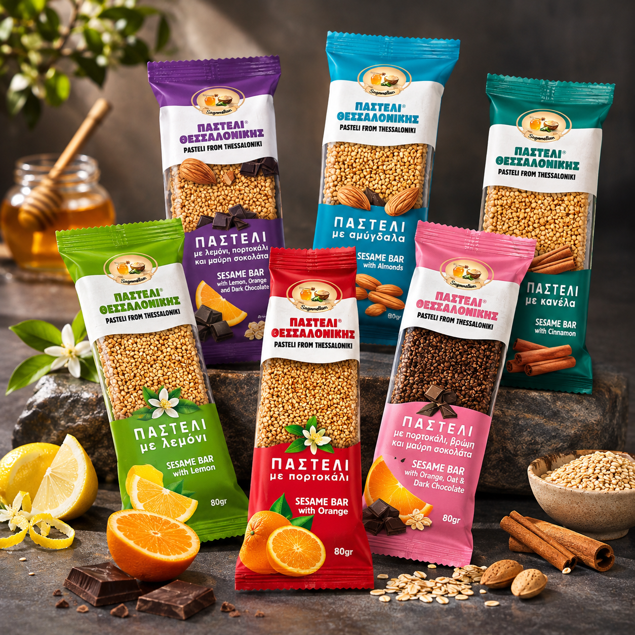
Each flavour has its own colour, so the range is easy to read from a distance:
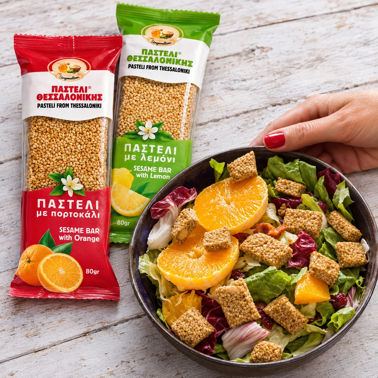
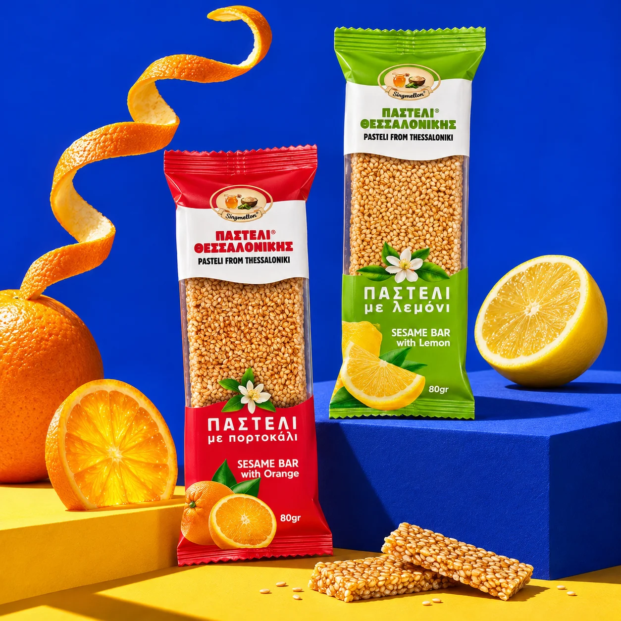
- Lemon: fresh green.
- Orange: warm red.
- Almonds: clear blue.
- Cinnamon: deep teal.
- Lemon, orange and dark chocolate: rich purple.
- Orange, oat and dark chocolate: soft pink.
The white band and the window stay the same on every pack, so the six bars line up as one family while each flavour stands out. This is pasteli packaging design that works as a system, ready for new flavours to join.
Ingredients you can see
Around the window and in the colour panel, the real ingredients are drawn in detail: lemon and orange slices, almonds, cinnamon sticks, oat flakes and squares of dark chocolate. A small white orange blossom with green leaves appears on every pack, a quiet nod to the citrus groves of Greece and to the natural flavours inside.
In this pasteli packaging design, showing ingredients instead of claims keeps the pack clean and lets the product speak for itself, which suits a 100% natural bar.
Made for shelves, gifts and export
The 80 g flow-wrap format fits snack shelves, kiosks and check-out counters. Bilingual names in Greek and English help the bars travel, from Thessaloniki shops to visitors and to export. The same layout works on every flavour and every future size, and the pasteli packaging design looks just as good in a rustic setting as on a bold, modern display.
Why this pasteli packaging design works
- It proves the claim. The clear window shows a natural bar instead of describing one.
- It is easy to choose. One colour per flavour makes the right bar quick to find.
- It feels trustworthy. A classic layout with a light modern touch suits a traditional Greek sweet.
The result is pasteli packaging design that turns a simple, honest recipe into a brand people can recognise and return to.
Services in this project
This project combined our brand identity, label design and packaging work. See more food products projects.
Creating packaging for a natural food product? Tell us about it.