About the project
Hotel branding for Atlas Hotel in Paralia: a clear, confident logo carried through every point where guests meet the hotel. A website that makes booking simple, a brochure that shows the rooms and the place, and stationery for everyday use at reception. One calm, consistent voice from the first search to check-out.
Hotel branding works best when a guest can recognise a place in a second. For Atlas Hotel in Paralia, Pieria, we started from what guests come for: the sea in front of them and the green slopes of Mount Olympus behind.
Hotel branding that starts with one shape
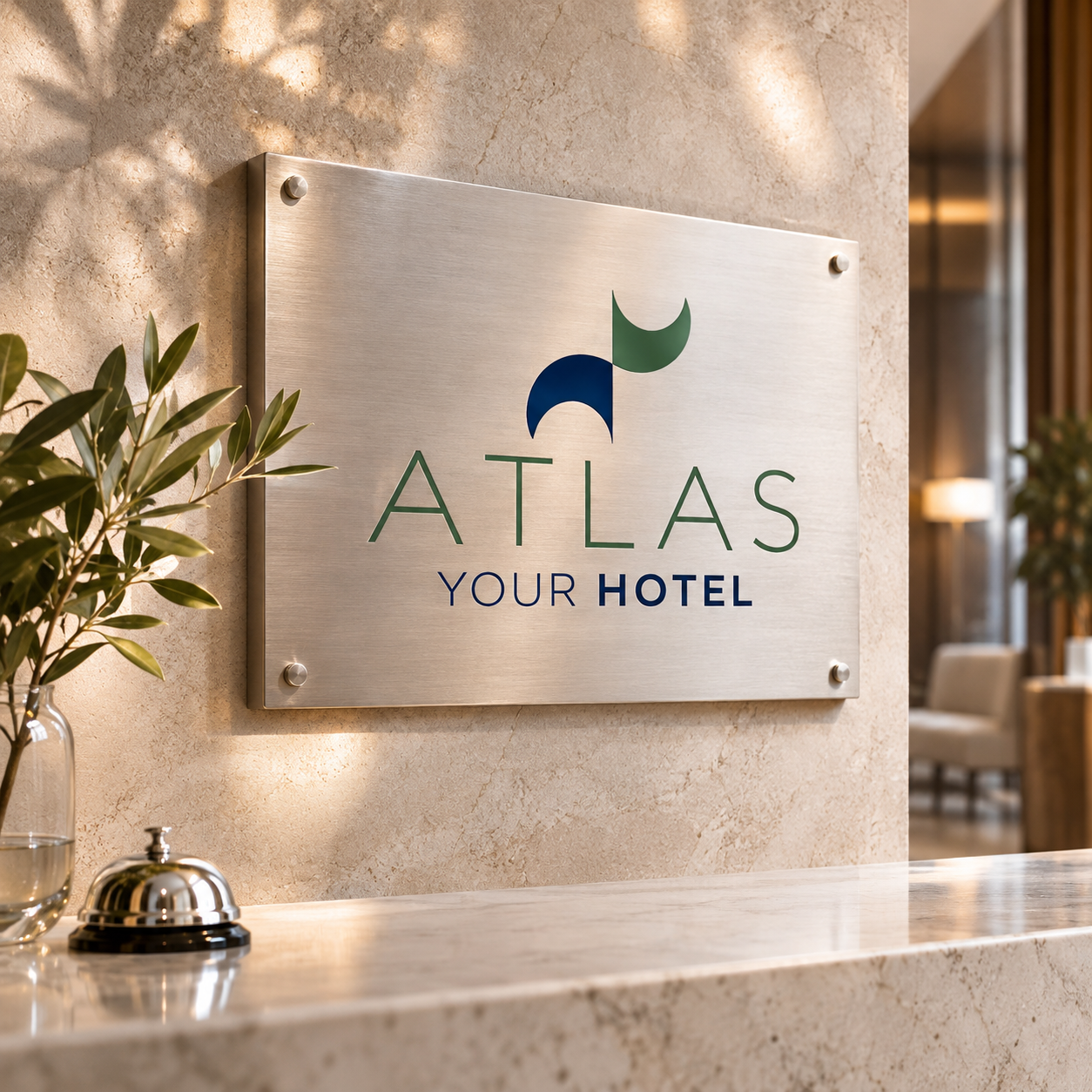
The new logo turns that view into a single form. A blue wave and a green leaf are the same shape, turned and recoloured: sea and land, side by side. The wordmark sits below in open, generous capitals, with “Your Hotel” as a warm line underneath.
One shape doing two jobs keeps the mark simple. It reads clearly on a phone screen, on a key card and on a sign by the road, and it gives the hotel a symbol it can use on its own.
The research behind the logo
Before drawing, we looked at how people choose a hotel on the Pieria coast. They look at the beach, the rooms, the distance to the sea and the feeling of the place. Many seaside hotels use the same suns, columns and waves, so a guest scrolling through booking sites sees one hotel after another that looks the same.
We wanted a mark that feels Greek without the clichés. The name helped. In Greek mythology Atlas holds up the sky, and the hotel’s own line, “where the sea met the gods”, links the myth to the coast below Olympus. The logo answers it quietly: one form that carries both the sea and the mountain.
From logo to guest experience
Good hotel branding is more than a logo. We carried the identity through every point where guests meet the hotel:
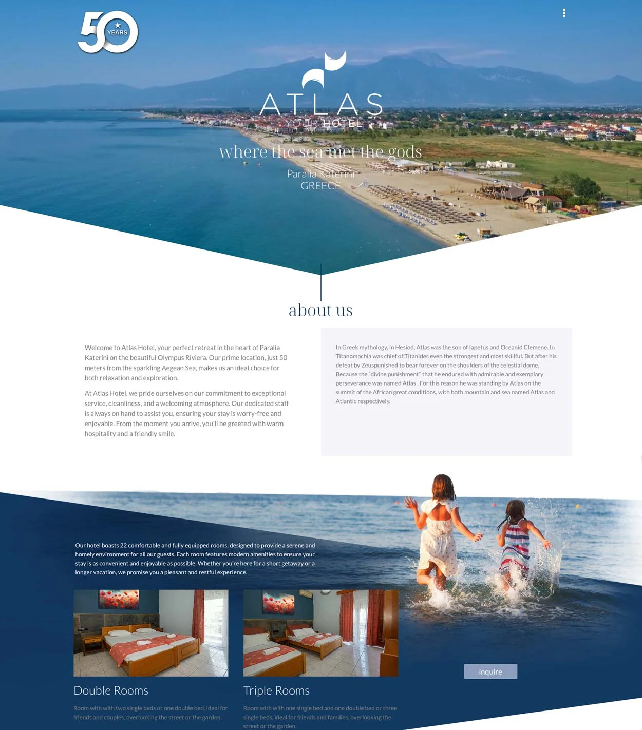
- Website: an image-led site where the rooms, the location and booking are always one tap away. See the live site at atlasparalia.com.
- Brochure: the story of the place, the double and triple rooms and the beach, told in the same blue and green.
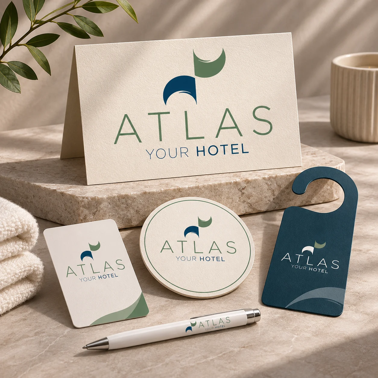
- Stationery and room items: key cards, door hangers, coasters, table cards and pens, so the brand is there in the room as well as online.
Each piece uses the same two colours, the same type and the same calm spacing. The hotel speaks with one voice, from the first search to check-out.
Colour, type and detail
The hotel branding palette takes deep sea blue and olive green straight from the landscape around the hotel. Warm white and light stone backgrounds keep everything bright and relaxed, the way a summer morning by the sea feels.
The wide capitals of ATLAS give a sense of space and calm. A lighter weight for “Your Hotel” keeps the tone friendly rather than formal. The mark works embossed on card, printed small on a pen, or in white on a deep blue door hanger.
Why this hotel branding works
Strong hotel branding does three things. It makes the hotel easy to remember, it sets the right expectation before arrival, and it makes the stay feel looked after in every small detail.
For Atlas, the simple shape does the first job: one wave, one leaf, one hotel. The colours and photography do the second, showing the sea, the rooms and the green of Pieria honestly. The room items do the third: when the same calm design appears on the key card and the coaster, guests feel the care that went into the whole place.
Hotel logo design and identity in practice
A logo for a hotel has to work in many places at once: booking platforms, Google Maps, the entrance sign, towels, receipts and social media. We tested the Atlas mark at very small sizes, on dark and light backgrounds and in one colour, so it stays clear wherever it appears.
The result is a hotel branding system the team can use every day without a designer: clear rules for colour, type and spacing, and templates for the pieces they print most.
Services in this project
This project brought together our brand identity, logo design, web design and print and editorial work. See more hospitality and tourism projects.
Planning hotel branding for your own property? Tell us about it.