About the project
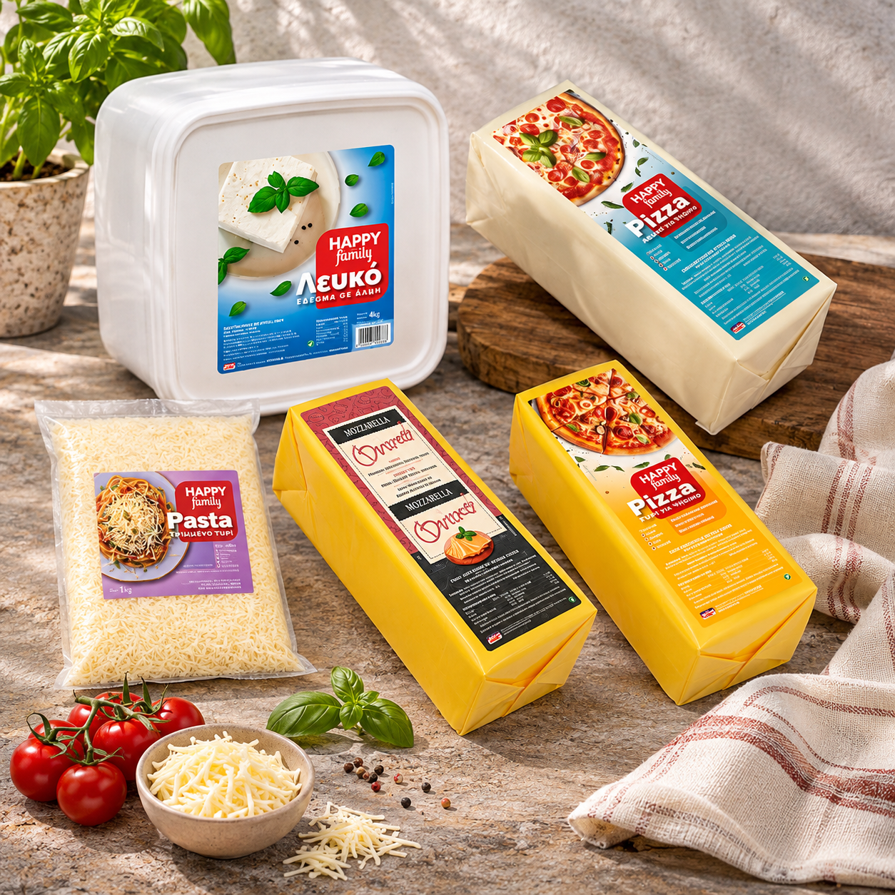
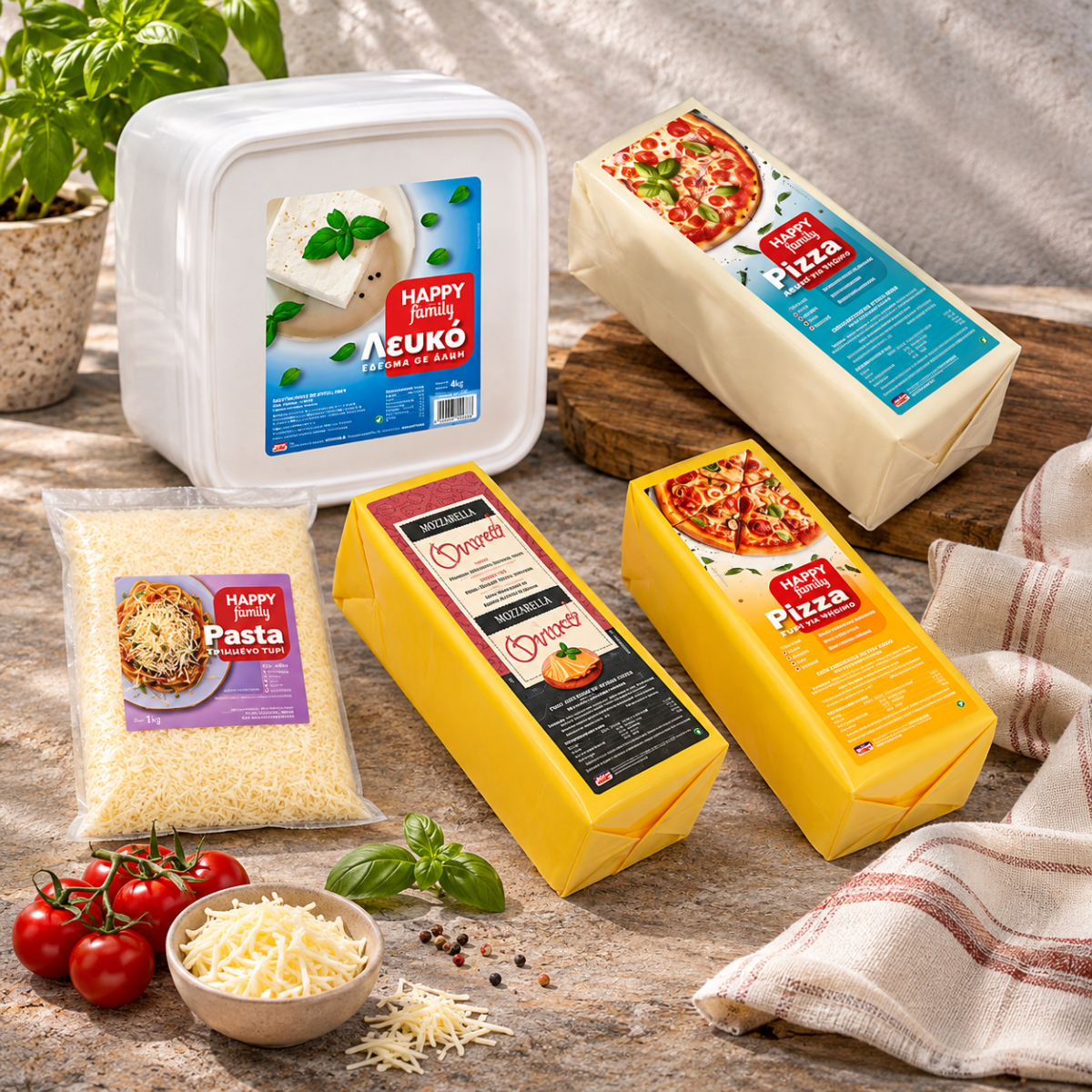
Food label design and brand identity for Happy Family, a range by Family Food in Thessaloniki. From white in brine to products for pizza and grated toppings for pasta, each label has its own colour and dish, held together by one bold red logo that is easy to spot and easy to trust.
Good food label design answers one question before any other: what is this for? For Happy Family, the everyday range of Family Food in Thessaloniki, we built the whole identity around that answer, from the logo to every label on the shelf.
Food label design that starts with the dish
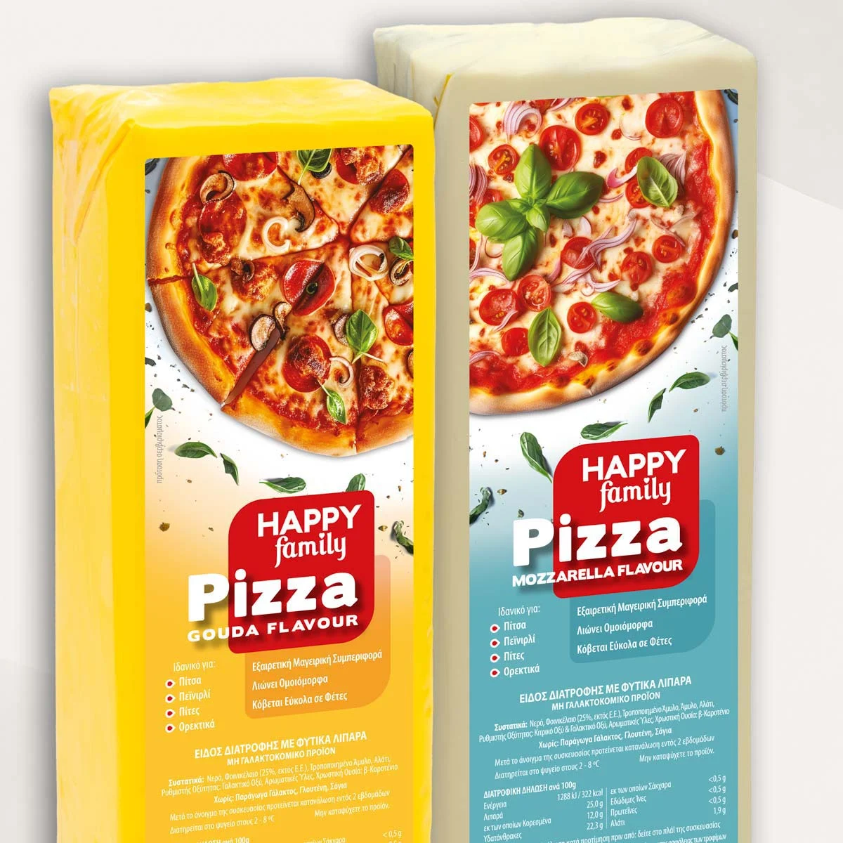
Most labels in this category look alike: a product shot, a long name and a list of features. We turned the order around. Each Happy Family label leads with the finished dish, a pizza fresh from the oven or a plate of pasta, so the buyer sees the result first and the product second.
The name of each line is short and large, such as Pizza or Pasta, with the flavour underneath in clear capitals. A busy cook or shop owner can find the right pack in a second, even from across the room.
A logo that feels like home
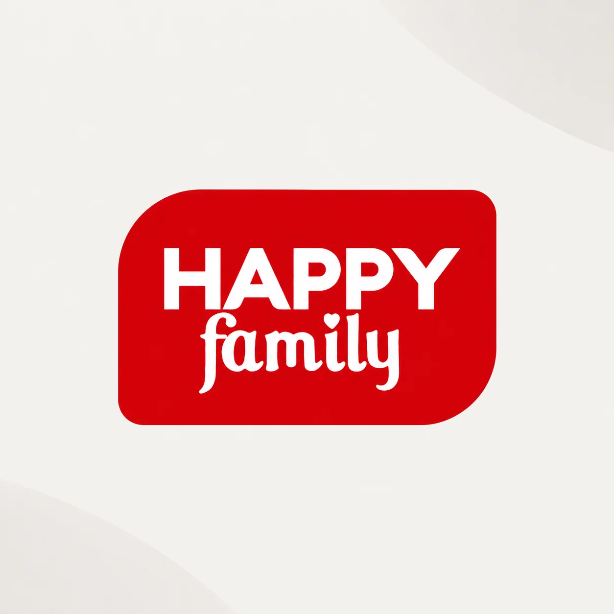
The Happy Family logo is a warm red shape with two softly rounded corners, like a friendly speech bubble. Inside, HAPPY is set in bold, solid capitals, and family follows in a relaxed script with a small heart as the dot on the i.
The contrast says everything about the brand: reliable and strong, but made for the family table. The red shape works as a seal on every pack, always in the same place, so the range reads as one family on the shelf.
One colour for each use
Colour does the sorting. Every line has its own background: warm yellow and orange for Gouda flavour, cool blue for Mozzarella flavour, and its own shade for each other product in the range. The logo, layout and type stay the same, so the food label design feels consistent while each product stays easy to tell apart.
The colours were chosen to sit well next to the food photography and to stay clear on large blocks and tubs, where the label is the only thing a customer sees.
Clear information, ready for the kitchen
Each label carries the details buyers ask about, in a fixed order. Under “Ideal for” a short list with small red markers shows the uses, such as pizza, peinirli, pies and appetizers. Beside it, three short lines describe how the product behaves: it cooks well, melts evenly and slices easily.
Below, the legal and nutrition information sits in a calm, readable block. Keeping these areas in the same place on every label is practical food label design: the range is faster to read and simpler to update when a new product joins.
Art direction for the food photography
We art-directed the photography to match the identity: dishes shot from above, bright natural colour, fresh basil and herbs scattered around the frame. The same style runs through every label, so new products can be added without the food label design losing its look.
Why this food label design works
- It shows the result. The dish on the label tells buyers what to cook, not just what they are buying.
- It sorts by colour. One colour per line makes the range quick to scan on a shelf or in a storeroom.
- It stays one brand. The red logo, the fixed layout and the same photography style hold every product together.
The result is a food label design system that is easy to shop, easy to cook with and easy for Family Food to grow.
Services in this project
This project combined our brand identity, label design and art direction work. See more food products projects.
Planning labels for a new food range? Tell us about it.