About the project
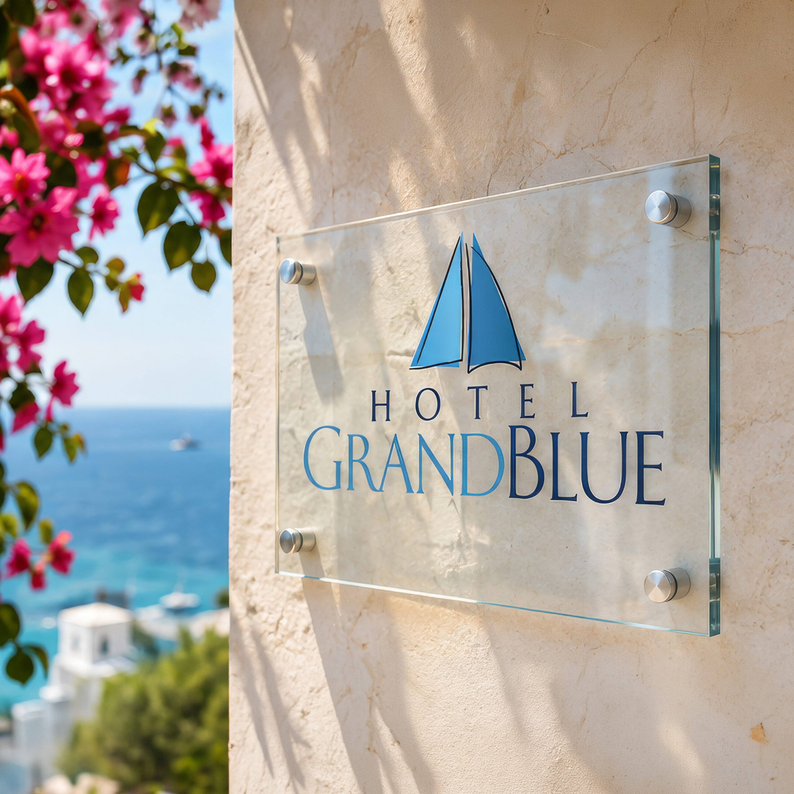
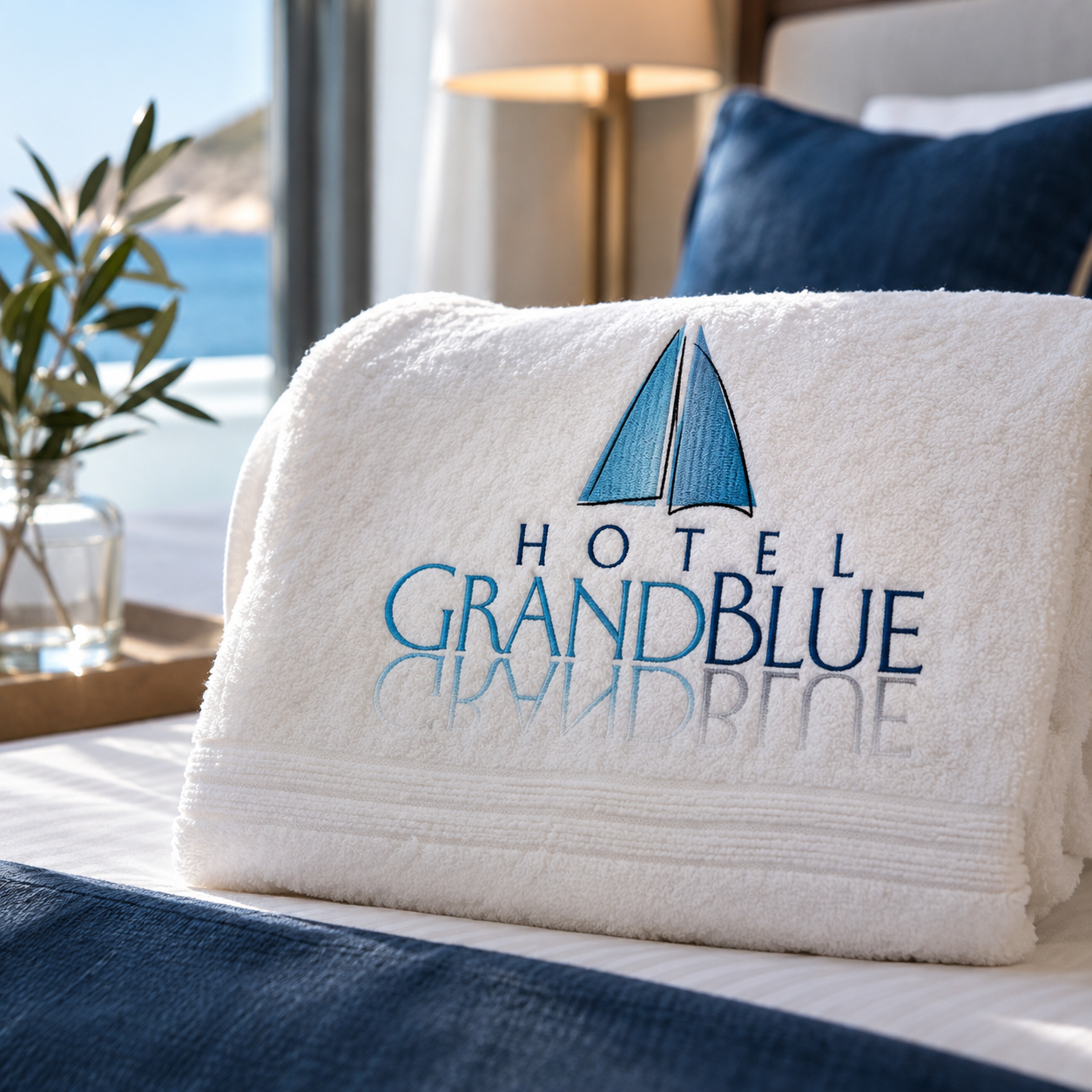
Hotel logo design, stationery and a brochure for Hotel Grand Blue. A simple sailing mark in two blues gives the hotel a calm, nautical identity that reads clearly on a glass sign at the entrance, on reception stationery and on embroidered towels in the rooms.
Hotel logo design has to work in a second: on a sign seen from the street, on a towel folded on the bed, on a card handed over at reception. For Hotel Grand Blue we designed a mark that does exactly that, together with the hotel’s stationery and its brochure.
Hotel logo design inspired by the sea
The name already held the idea. Grand Blue is the colour guests come for: the sea outside the window and the sky above it. We looked for one simple image that would carry that feeling without spelling it out, and found it in two sails.
The idea: two sails, two blues
The mark sets a light blue sail beside a deep blue one, leaning together like boats sharing the same wind. Light and deep are the two blues of the sea, the shallow water near the shore and the open water further out. A thin dark line draws each sail, so the shapes stay crisp even when they are embroidered or printed small.
The wordmark repeats the same split. GRAND is set in light blue and BLUE in deep blue, so the name and the symbol tell one story. Above it, HOTEL is spaced wide in small capitals, quiet and confident, leaving the name to lead.
Typography with a classic, relaxed tone
For this hotel logo design, the letters are elegant serif capitals with a hand-drawn softness. They feel established without being stiff, which suits a hotel by the sea: welcoming first, formal second. The wide spacing of HOTEL gives the logo air and makes it easy to read on a wall or a door.
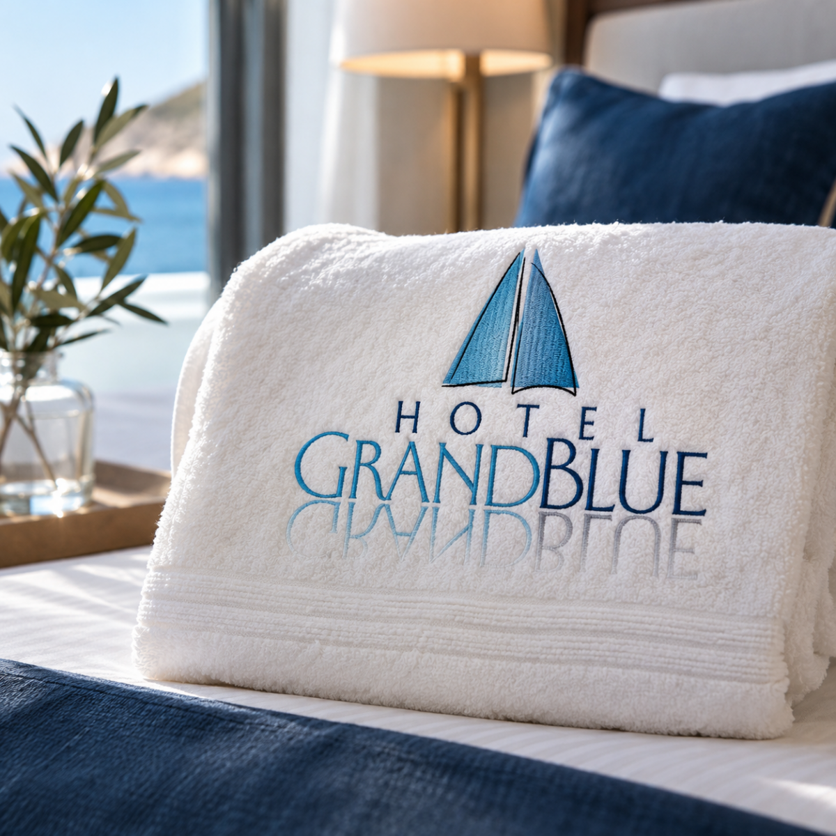
On towels and textiles the name gains a mirrored line below it, fading out like a reflection on still water. It is a small detail that guests notice once and remember.
Stationery and brochure
A good hotel logo design is only the start. We carried the identity onto the hotel’s stationery, so every letter, card and form from reception speaks with the same calm voice in the same two blues.
Every piece follows the same simple rules: the sailing mark in one corner, the two blues used sparingly, and plenty of white so the paper feels light and clean. Contact details, room information and small notes for guests all sit in the same calm type, so even the most everyday document looks like it belongs to the hotel.
The brochure brings it together for guests and partners. It presents the hotel, its rooms and its setting with generous white space, the two blues as accents and the sailing mark as a steady signature on every page.
Why this hotel logo design works
- It is simple. Two shapes and two colours are easy to remember and easy to reproduce, from a glass sign to a thread embroidery.
- It belongs to the place. Sails and blue water say “seaside hotel” without using the usual suns, waves and columns.
- It holds together. The same split of light and deep blue runs through the symbol, the name and every printed piece.
The result is a hotel logo design the team can use every day, on paper, on signs and on linen, and still recognise from across the lobby.
Services in this project
This project combined our logo design, stationery and print and editorial work. See more hospitality and tourism projects.
Planning a new identity for your hotel? Tell us about it.