About the project
Beauty e-shop design and logo for Queens PMU Supplies, a shop for professional permanent makeup products. A script wordmark with a hidden profile and a gold crown leads into an elegant online store for pigments, needles and machines, made for artists who order often and need to find things fast.
Beauty e-shop design has two audiences at once. It has to feel as refined as the beauty work it supports, and it has to be fast and practical for professionals who order supplies between appointments. For Queens PMU Supplies, a shop for permanent makeup artists, we designed the logo and the online store with both in mind.
A logo with a queen inside
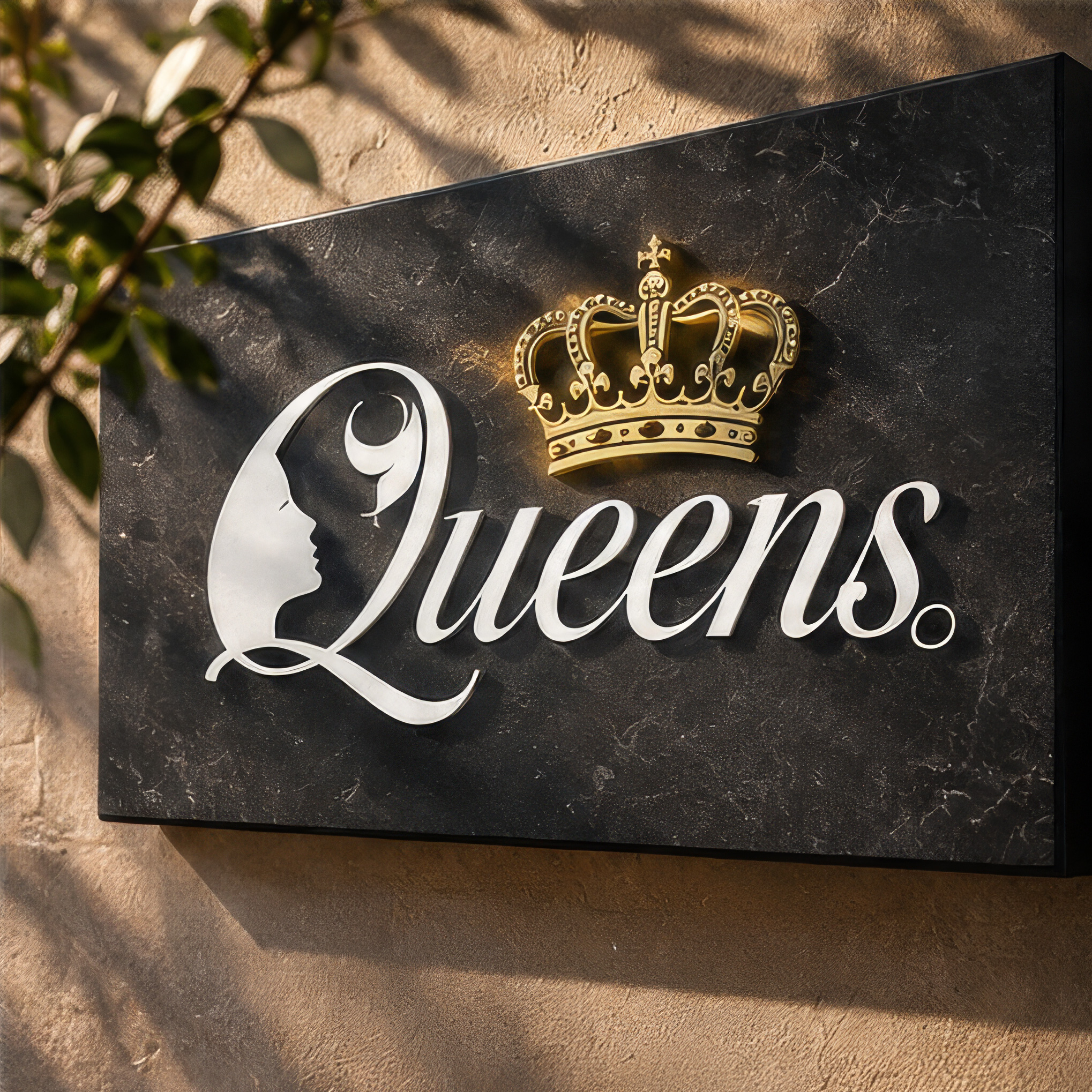
The name gave us the idea. Queens is set in a flowing script, and its capital Q holds the profile of a woman’s face, drawn with the same stroke as the letter. Above the name sits a small gold crown. Nothing is added for decoration: the face speaks of beauty and the art of permanent makeup, the crown of quality and confidence.
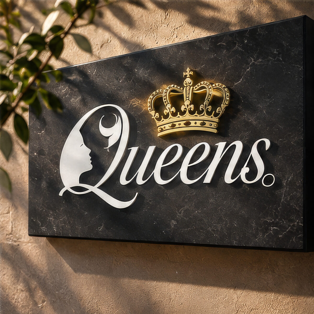
The script stays readable at small sizes, on a phone screen or a product sticker, and becomes a statement when it is made large, cut in metal on a black stone sign.
Beauty e-shop design that feels like a studio
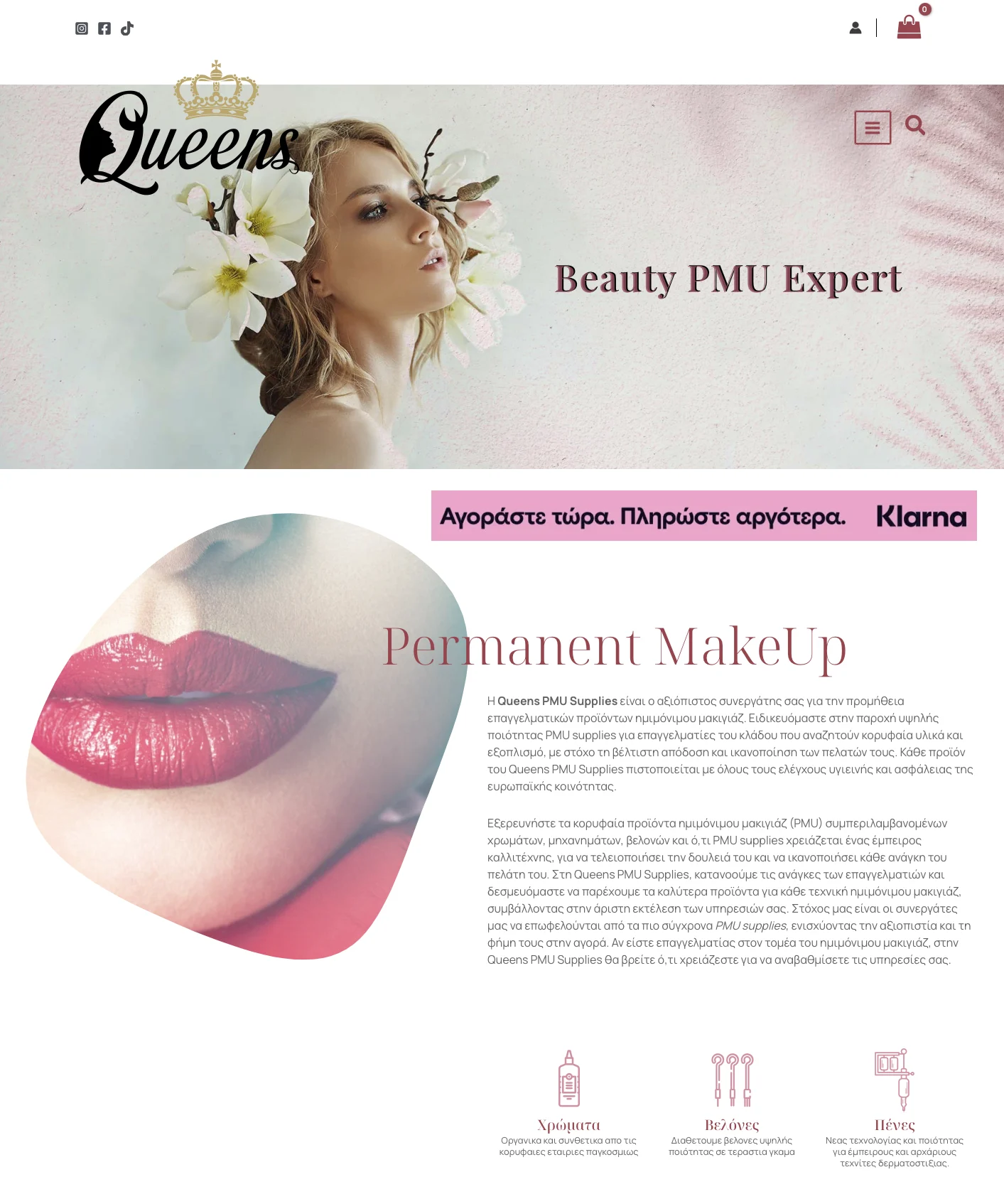
The shop opens with a calm, image-led page: a soft portrait, flowers and the line Beauty PMU Expert in an elegant serif. Rose and deep burgundy tones run through the headings, buttons and icons, close to the colours of the products and the lips and brows they help create.
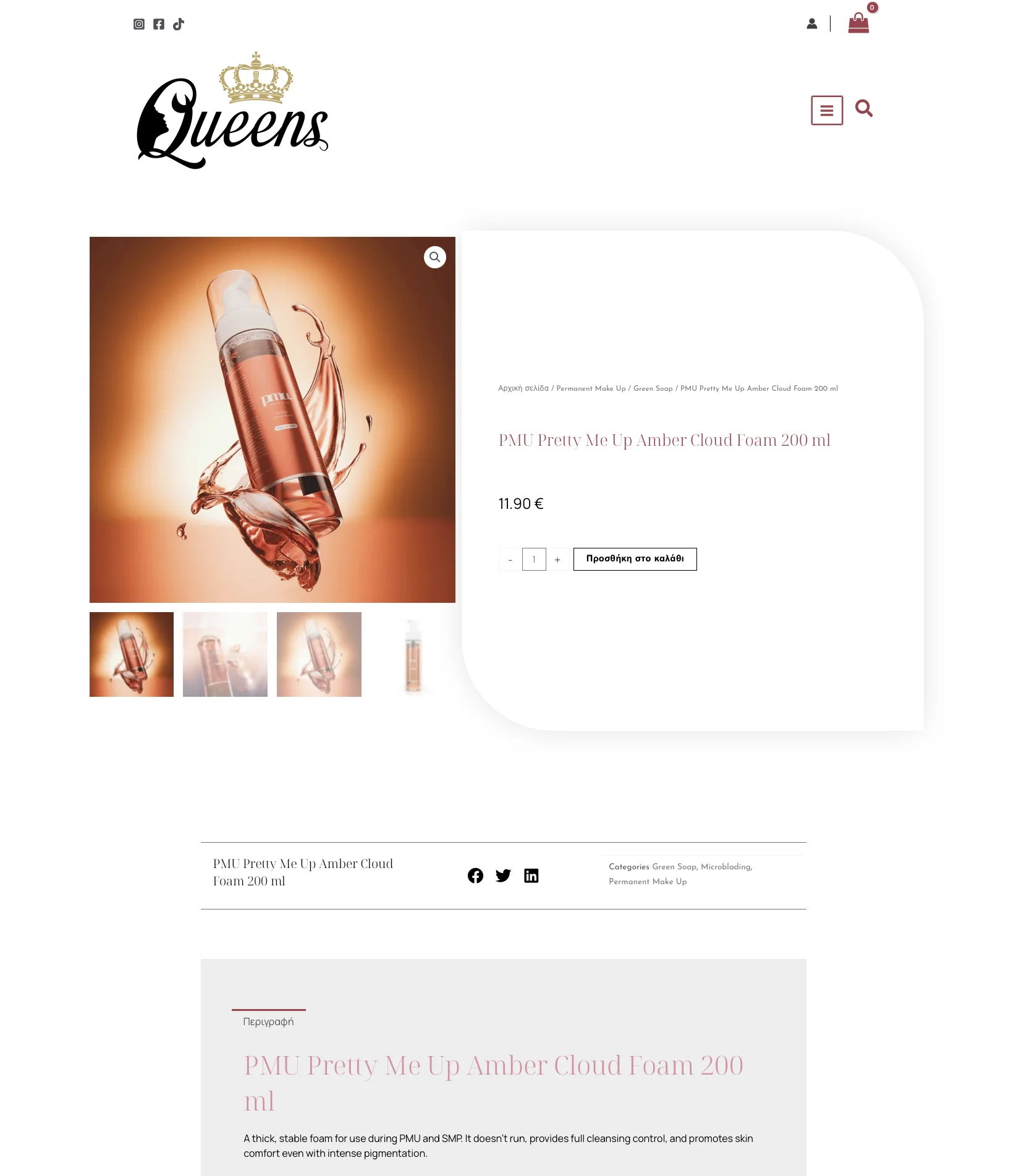
In this beauty e-shop design, plenty of white space keeps the pages light. Product photos sit on clean backgrounds in rounded frames, so pigments and foams look precise and premium, the way a professional expects them to.
Made for artists who order often
Good beauty e-shop design is about speed as much as style. Permanent makeup artists come back again and again for the same pigments, needles and machines, so the shop puts them a tap away:
- Clear categories with simple icons for colours, needles and machines.
- Search, account and cart always at the top of every page.
- Product pages with large photos, the price and the add to cart button side by side, and a short, practical description below.
- Flexible payment, with a buy now, pay later option highlighted on the home page.
The result is a shop where a returning customer can reorder in a few steps, and a new customer immediately understands what Queens PMU offers.
Trust built into the design
Professionals buying products for their clients’ skin need to trust the shop. The beauty e-shop design gives the shop’s message about certified products that meet EU health and safety requirements a clear, central place on the home page, and keeps information calm and easy to scan on every product.
Consistent type, colours and spacing across the whole site add to that feeling. A shop that looks carefully made feels like a supplier that chooses its products carefully too.
One identity from sign to screen
The logo and the beauty e-shop design work as one system. The crown and the script appear at the top of every page, the rose tones follow the customer from the home page to checkout, and the same identity carries onto signage and social media. Visit the shop at queenspmu.com.
Why this beauty e-shop design works
- It looks the part. Elegant type, a crown and soft colours match the world of permanent makeup.
- It is quick to use. Search, categories and cart are always in reach for busy professionals.
- It builds trust. A calm, consistent design supports a shop that sells certified products.
Services in this project
This project combined our logo design and web design work. See more professional services projects.
Planning an online shop or a new logo for your beauty brand? Tell us about it.